PORTFOLIO
A collection of projects
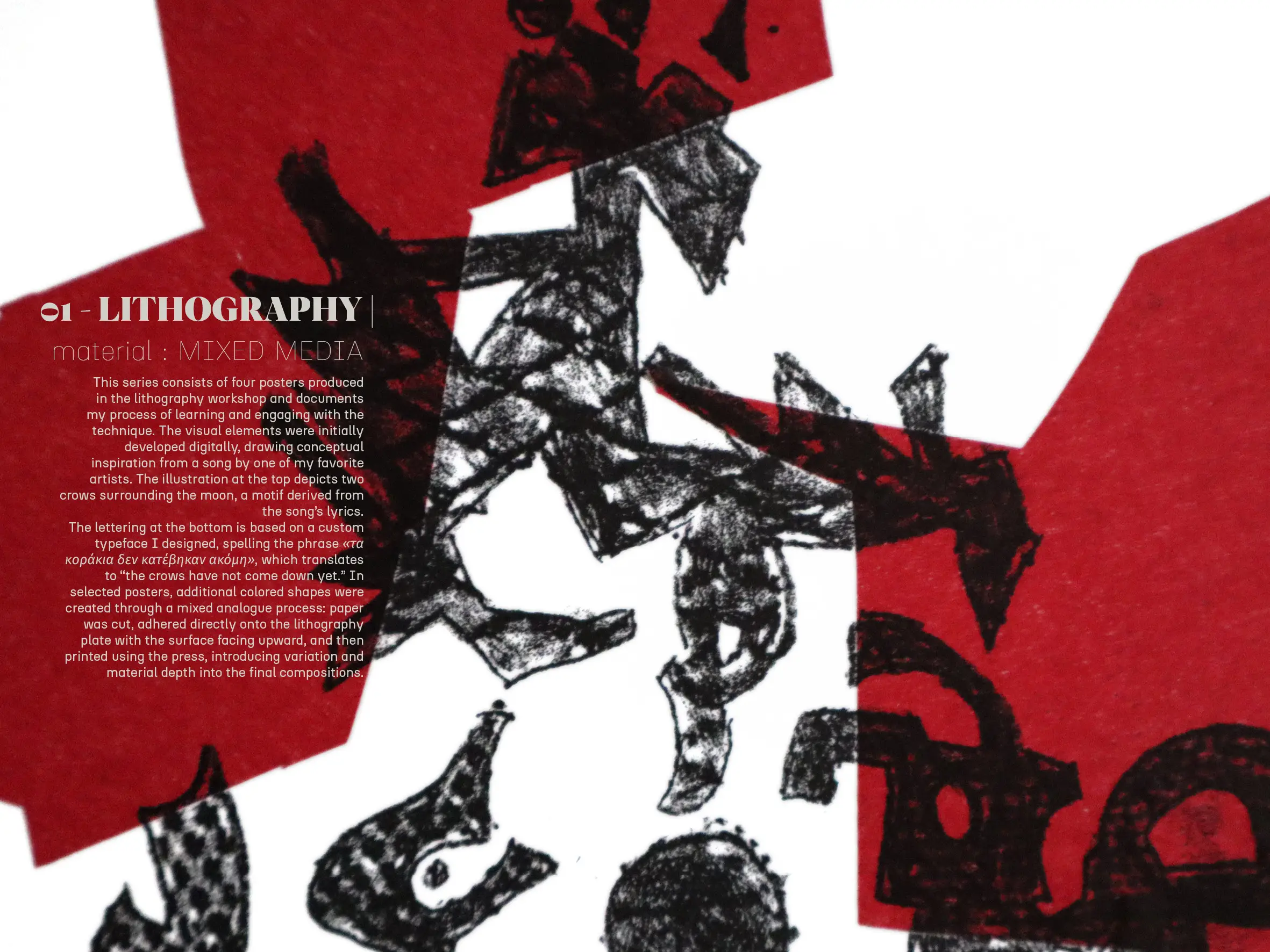
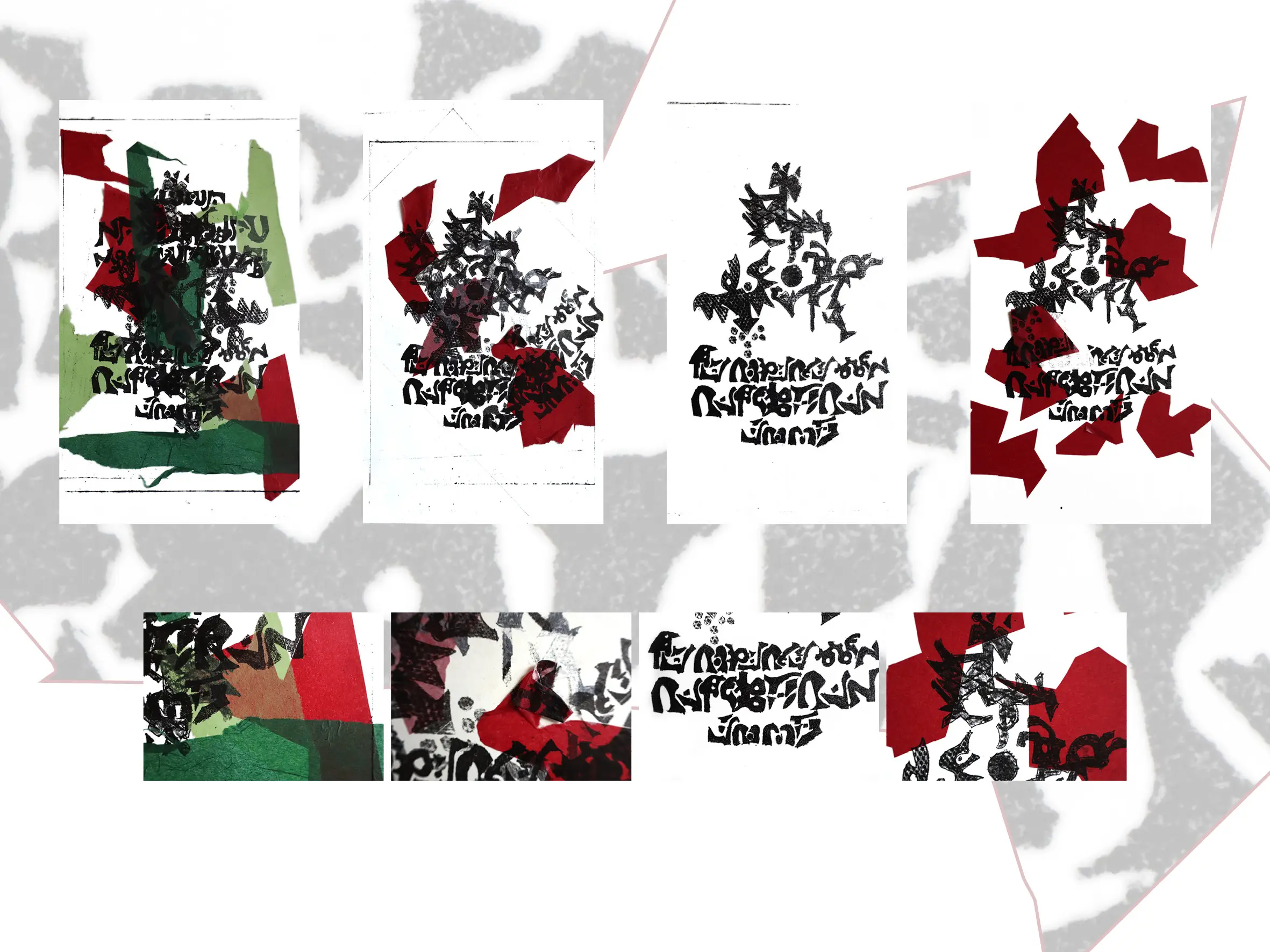
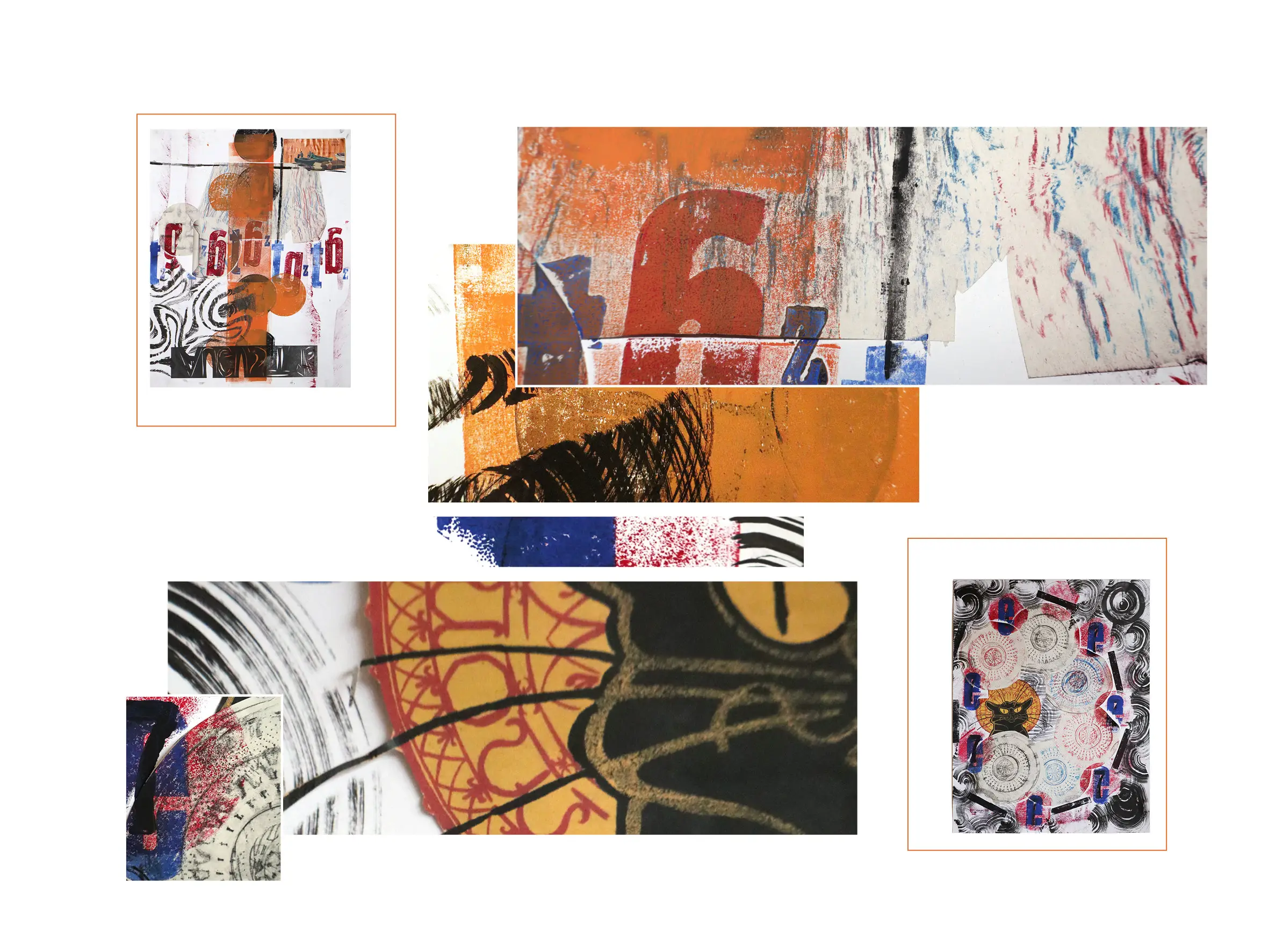
01 – Lithography |
material: MIXED MEDIA
This series consists of four posters produced in the lithography workshop and documents my process of learning and engaging with the technique , forming part of my broader designer portfolio focused on process, material exploration, and visual storytelling. The visual elements were initially developed digitally, drawing conceptual inspiration from a song by one of my favorite artists. The illustration at the top depicts two crows surrounding the moon, a motif derived from the song’s lyrics.
The lettering at the bottom is based on a custom typeface I designed, spelling the phrase «τα κοράκια δεν κατέβηκαν ακόμη», which translates to “the crows have not come down yet.” In selected posters, additional colored shapes were created through a mixed analogue process: paper was cut, adhered directly onto the lithography plate with the surface facing upward, and then printed using the press, introducing variation and material depth into the final compositions.
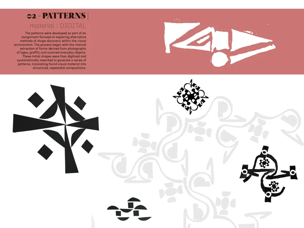
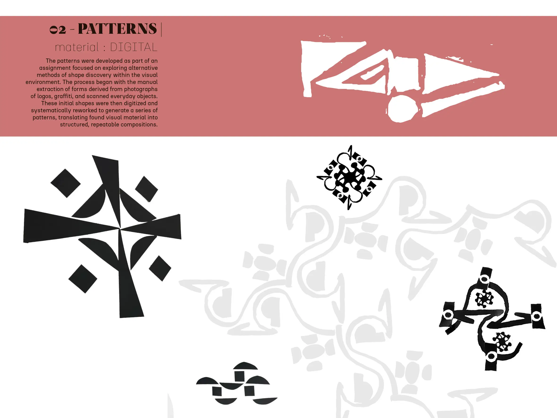
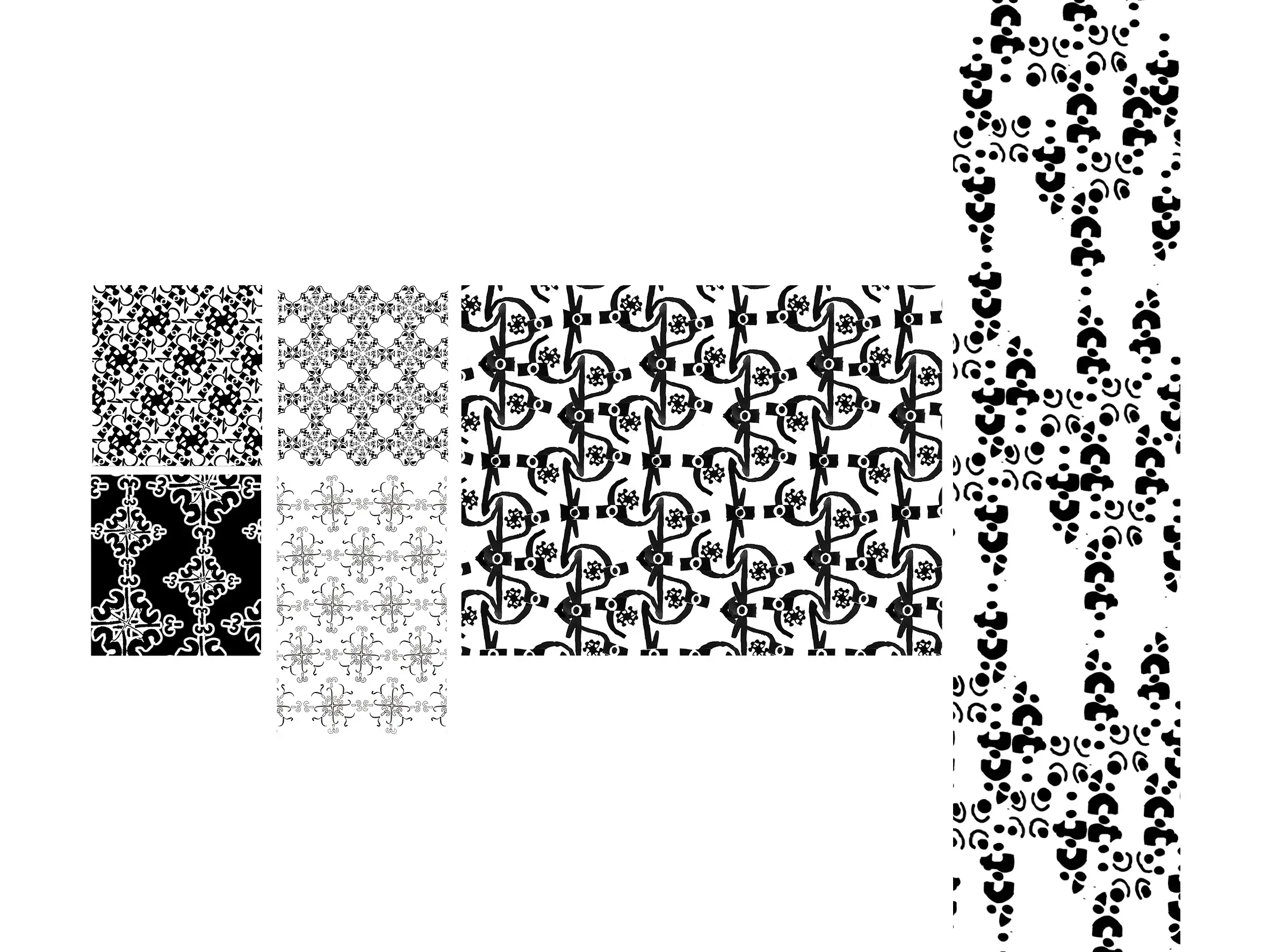
02 – PATTERNS |
material: DIGITAL
The patterns were developed as part of an assignment focused on exploring alternative methods of shape discovery within the visual environment. The process began with the manual extraction of forms derived from photographs of logos, graffiti, and scanned everyday objects. These initial shapes were then digitized and systematically reworked to generate a series of patterns, translating found visual material into structured, repeatable compositions.
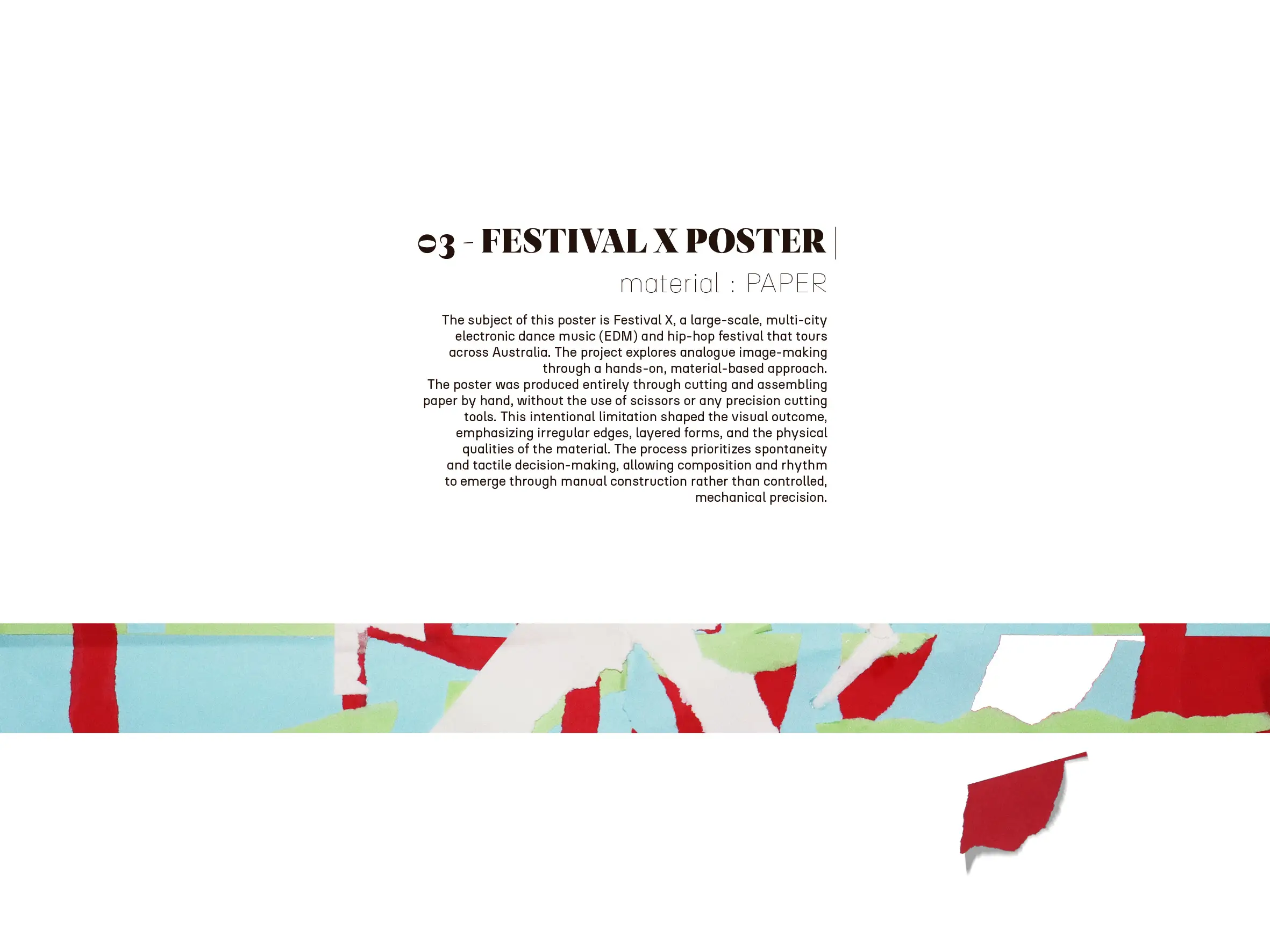
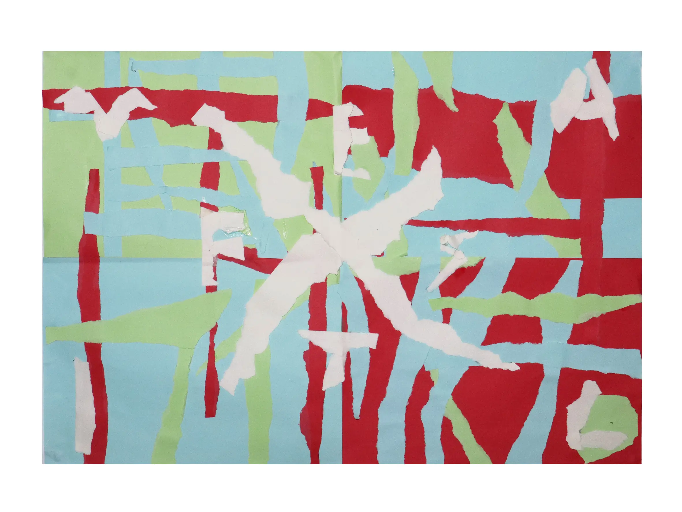
03 – FESTIVAL X POSTER |
material: PAPER
The subject of this poster is Festival X, a large-scale, multi-city electronic dance music (EDM) and hip-hop festival that tours across Australia. The project explores analogue image-making through a hands-on, material-based approach.
The poster was produced entirely through cutting and assembling paper by hand, without the use of scissors or any precision cutting tools. This intentional limitation shaped the visual outcome, emphasizing irregular edges, layered forms, and the physical qualities of the material. The process prioritizes spontaneity and tactile decision-making, allowing composition and rhythm to emerge through manual construction rather than controlled, mechanical precision
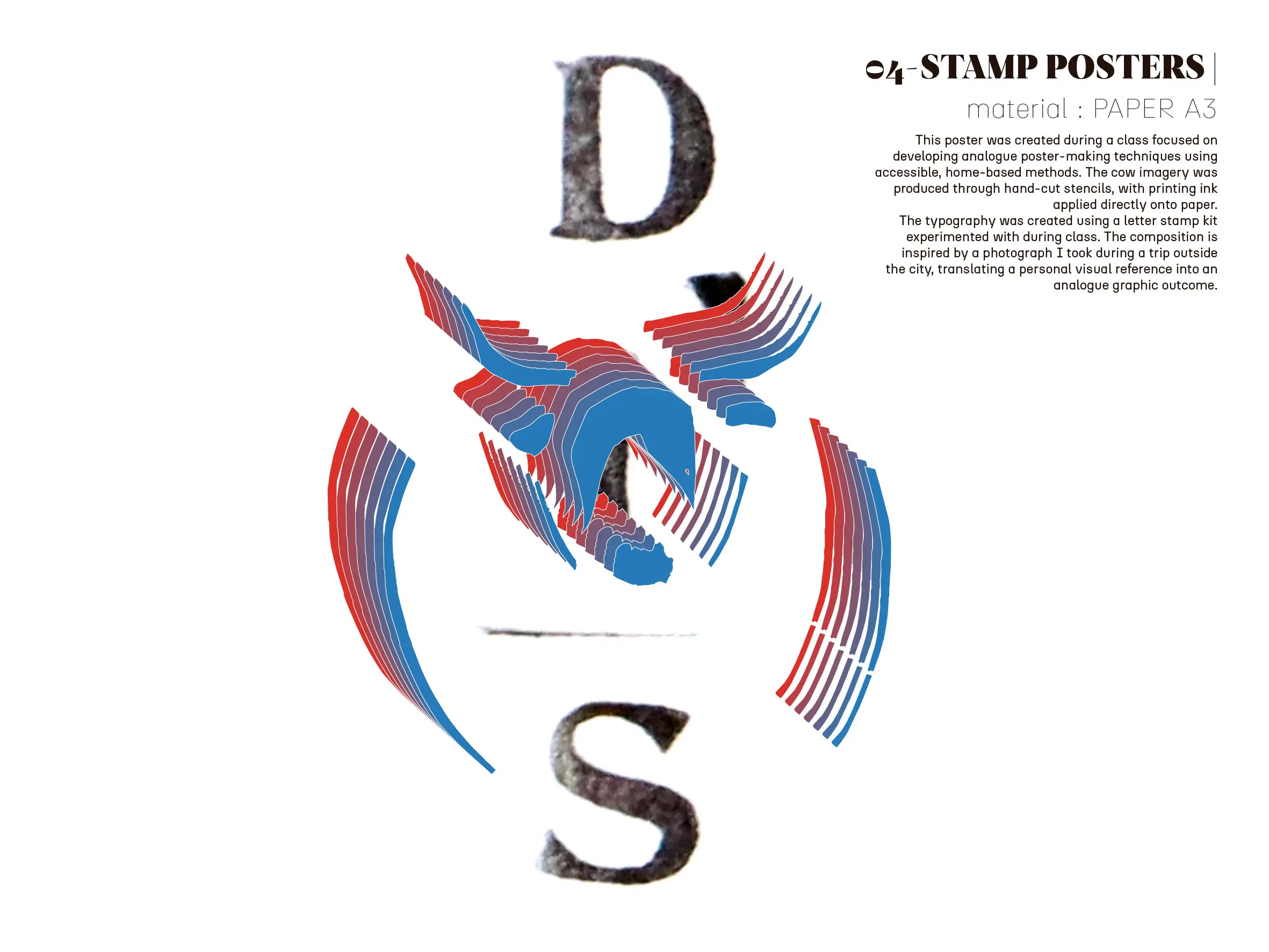
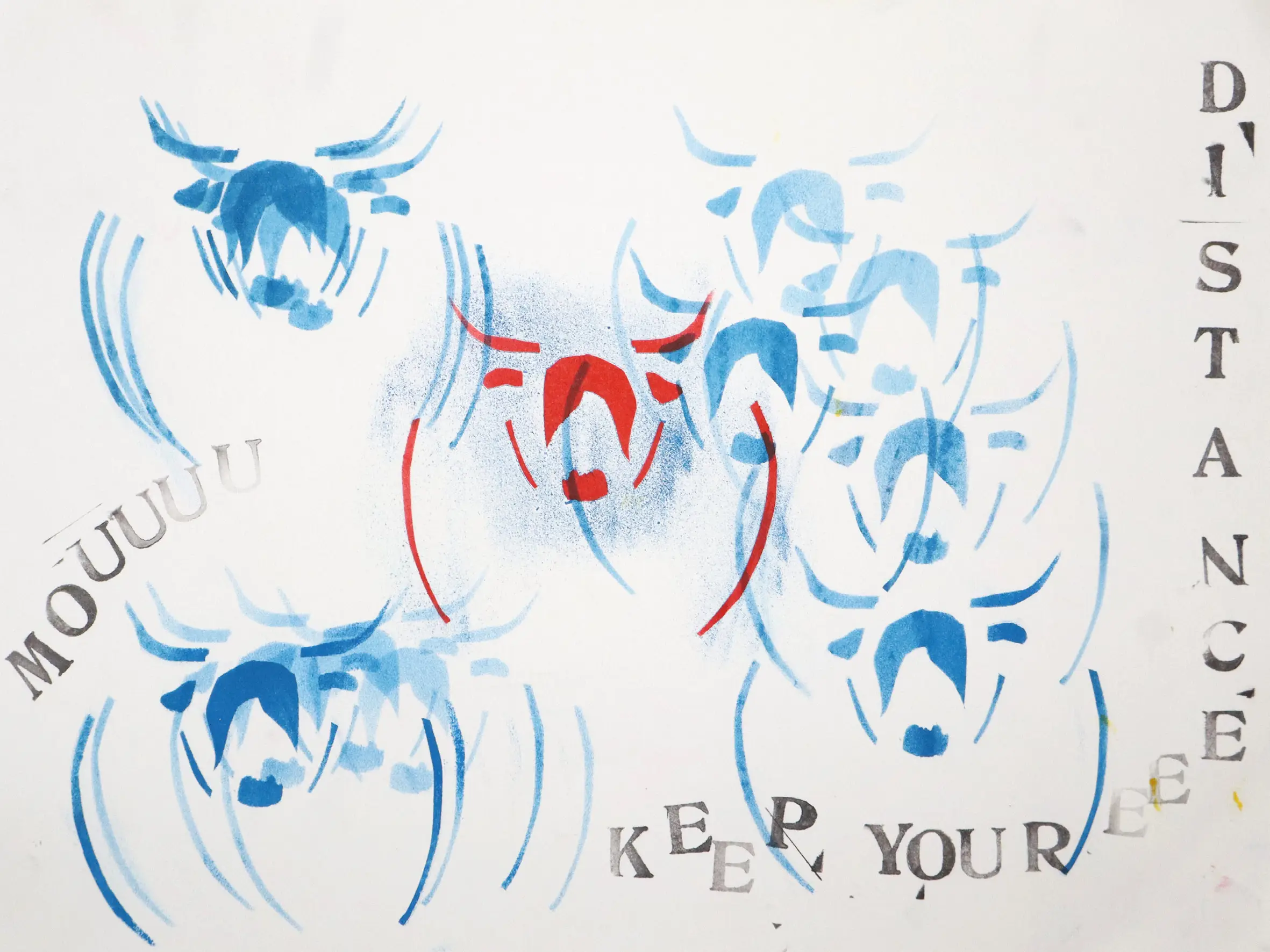
04 – STAMP POSTERS |
material: PAPER A3
This poster was created during a class focused on developing analogue poster-making techniques using accessible, home-based methods. The cow imagery was produced through hand-cut stencils, with printing ink applied directly onto paper.
The typography was created using a letter stamp kit experimented with during class. The composition is inspired by a photograph I took during a trip outside the city, translating a personal visual reference into an analogue graphic outcome.
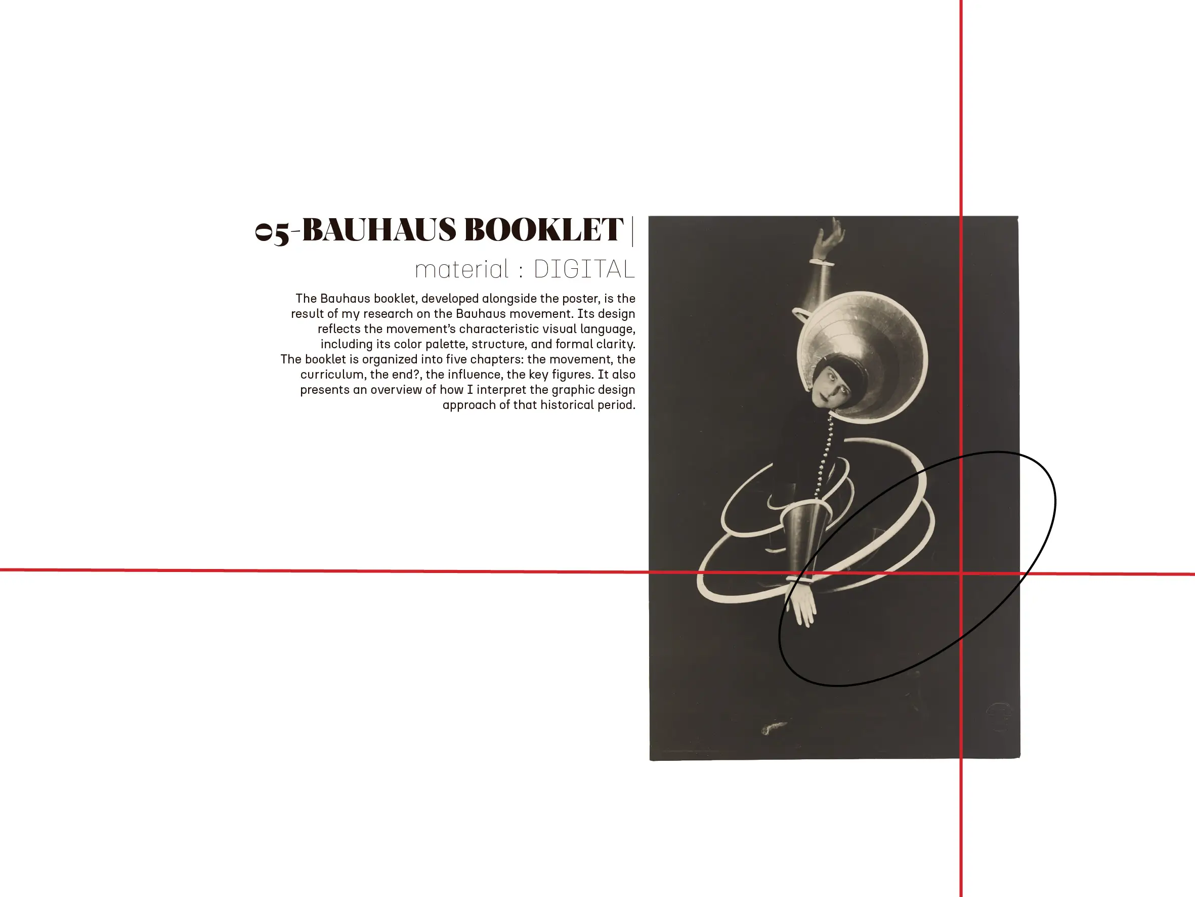
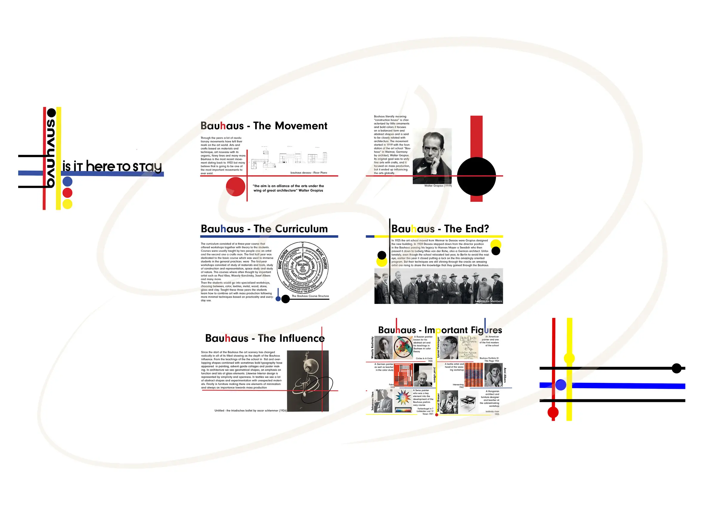
05 – BAUHAUS BOOKLET |
material: DIGITAL
The Bauhaus booklet, developed alongside the poster, is the result of my research on the Bauhaus movement. Its design reflects the movement’s characteristic visual language, including its color palette, structure, and formal clarity.
The booklet is organized into five chapters: the movement, the curriculum, the end?, the influence, the key figures. It also presents an overview of how I interpret the graphic design approach of that historical period.
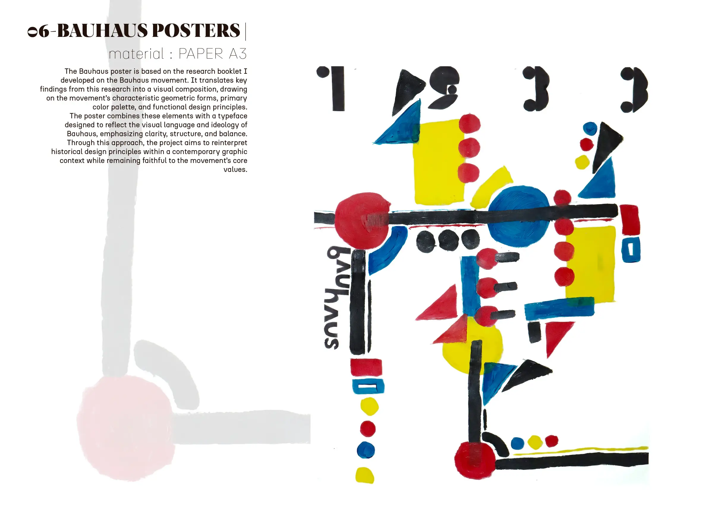
06 – BAUHAUS POSTERS |
material: PAPER A3
The Bauhaus poster is based on the research booklet I developed on the Bauhaus movement. It translates key findings from this research into a visual composition, drawing on the movement’s characteristic geometric forms, primary color palette, and functional design principles.
The poster combines these elements with a typeface designed to reflect the visual language and ideology of Bauhaus, emphasizing clarity, structure, and balance. Through this approach, the project aims to reinterpret historical design principles within a contemporary graphic context while remaining faithful to the movement’s core values.
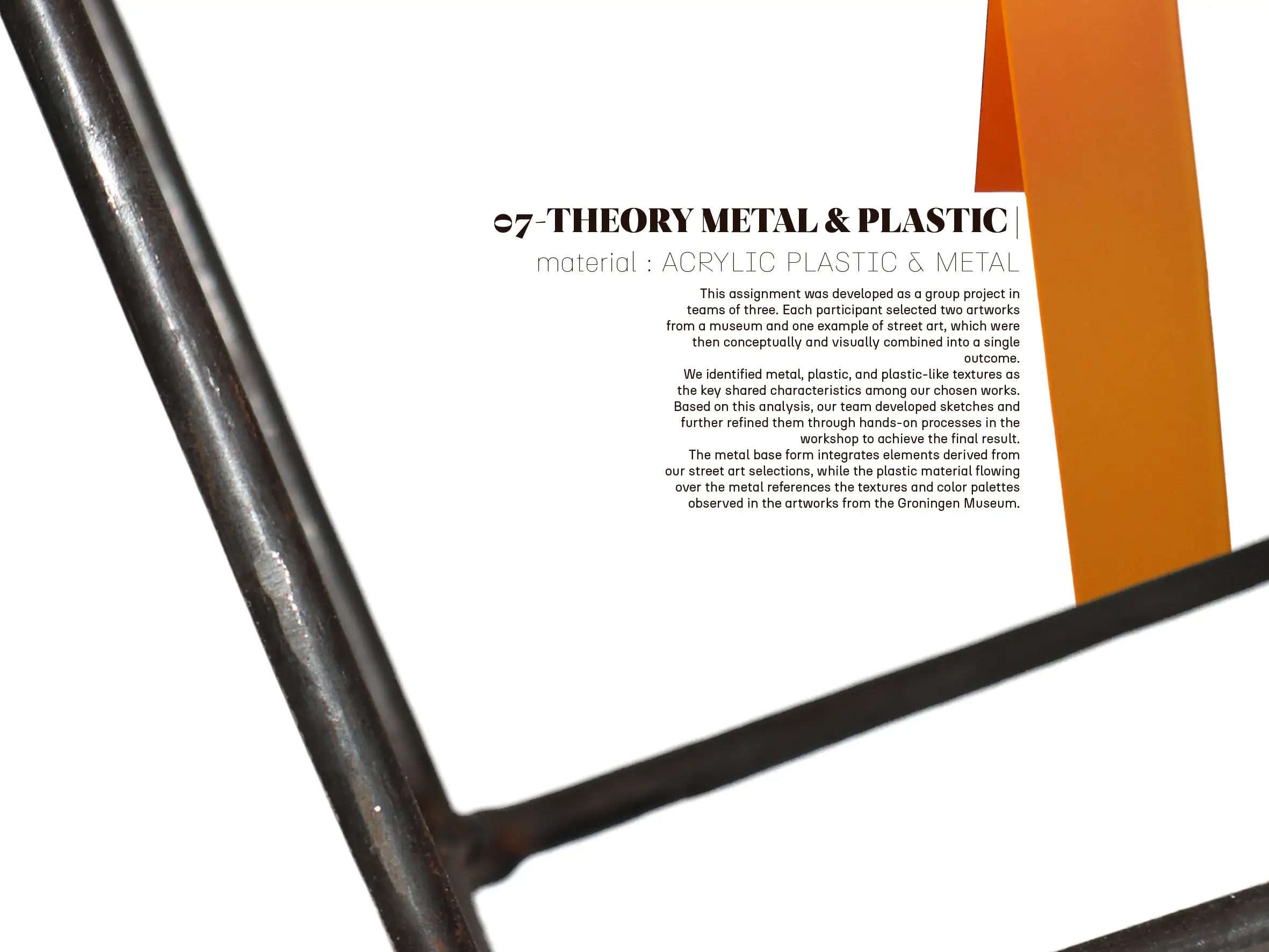
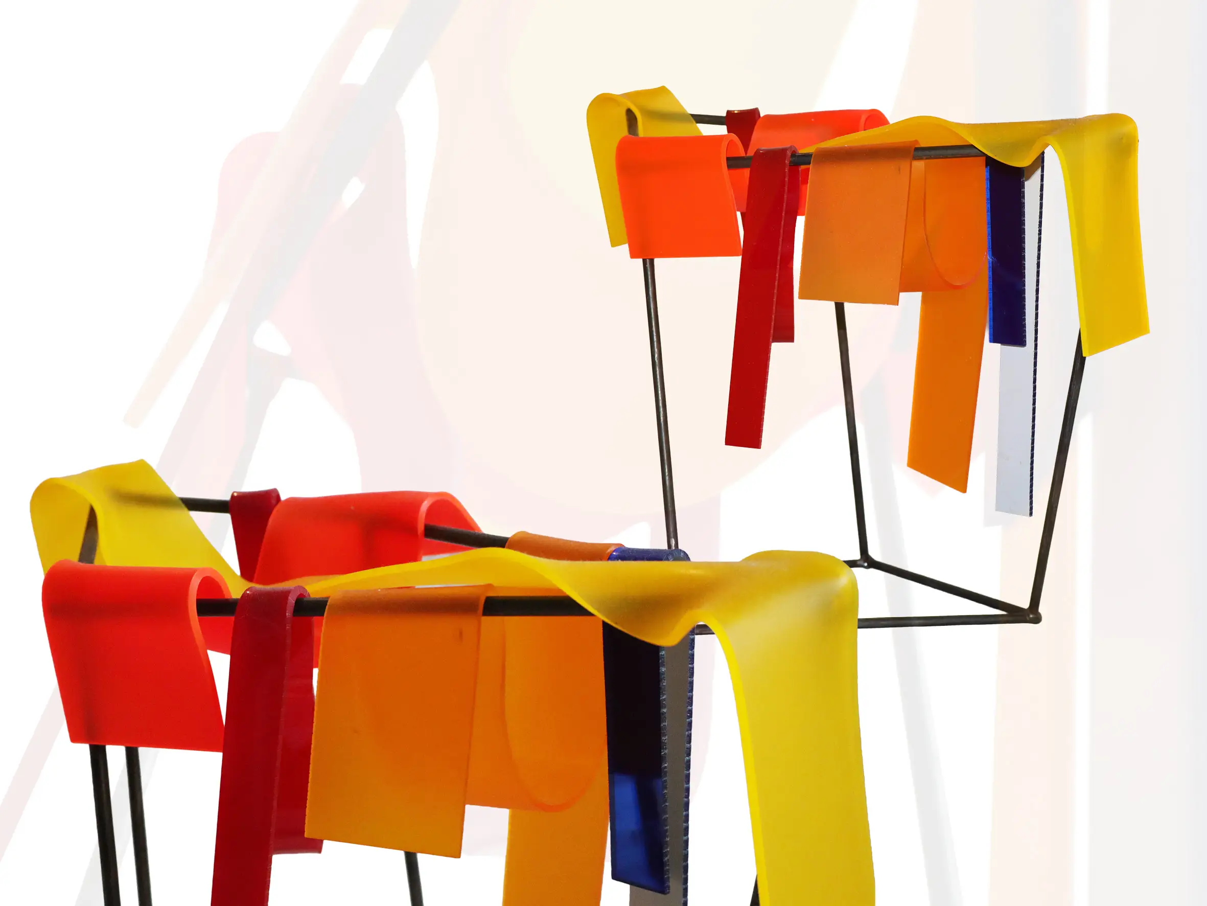
07 – THEORY METAL & PLASTIC |
material: ACRYLIC PLASTIC & METAL
This assignment was developed as a group project in teams of three. Each participant selected two artworks from a museum and one example of street art, which were then conceptually and visually combined into a single outcome.
We identified metal, plastic, and plastic-like textures as the key shared characteristics among our chosen works. Based on this analysis, our team developed sketches and further refined them through hands-on processes in the workshop to achieve the final result.
The metal base form integrates elements derived from our street art selections, while the plastic material flowing over the metal references the textures and color palettes observed in the artworks from the Groningen Museum.
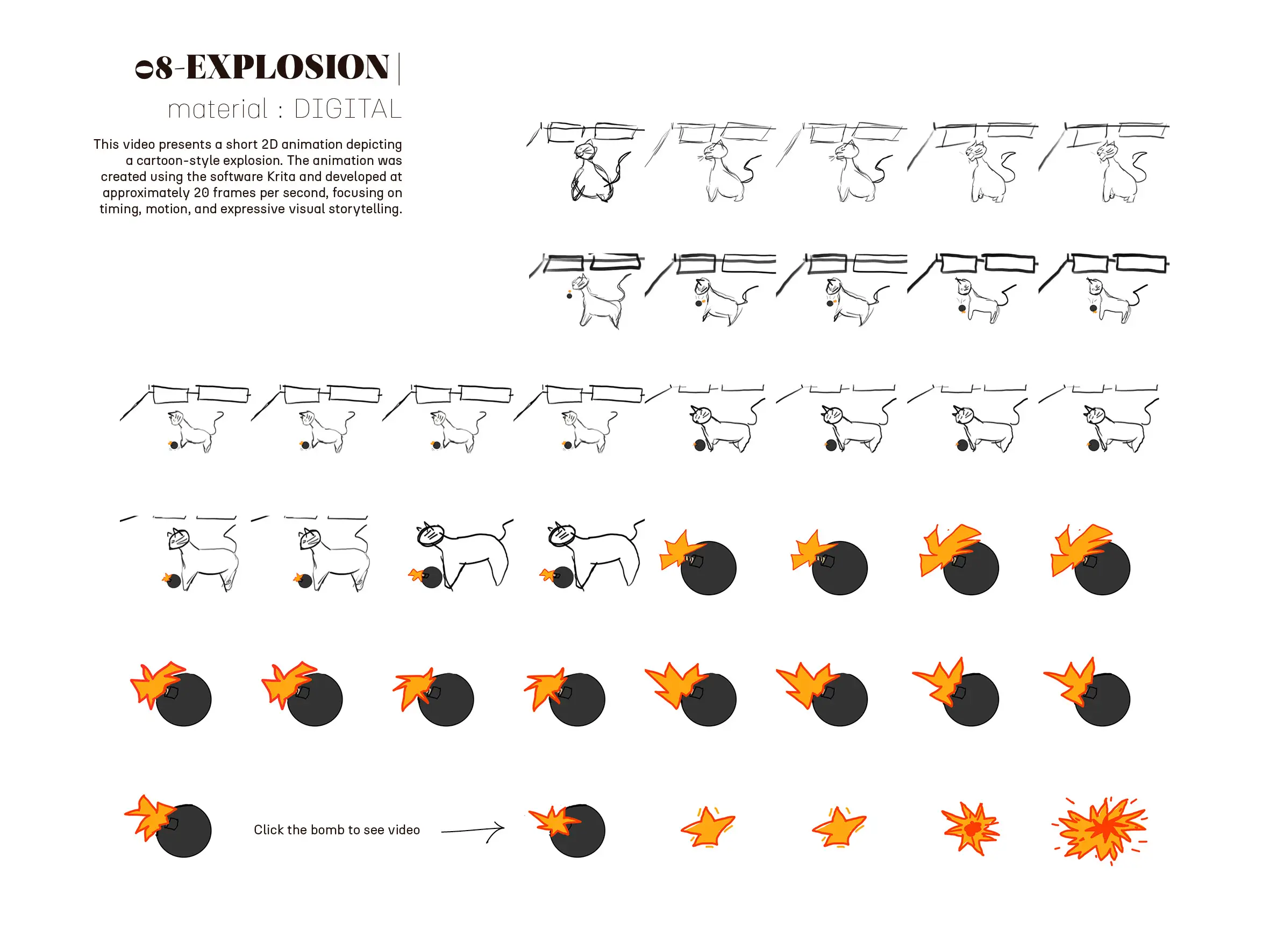
08 – EXPLOSION |
material: DIGITAL
This video presents a short 2D animation depicting a cartoon-style explosion. The animation was created using the software Krita and developed at approximately 20 frames per second, focusing on timing, motion, and expressive visual storytelling.
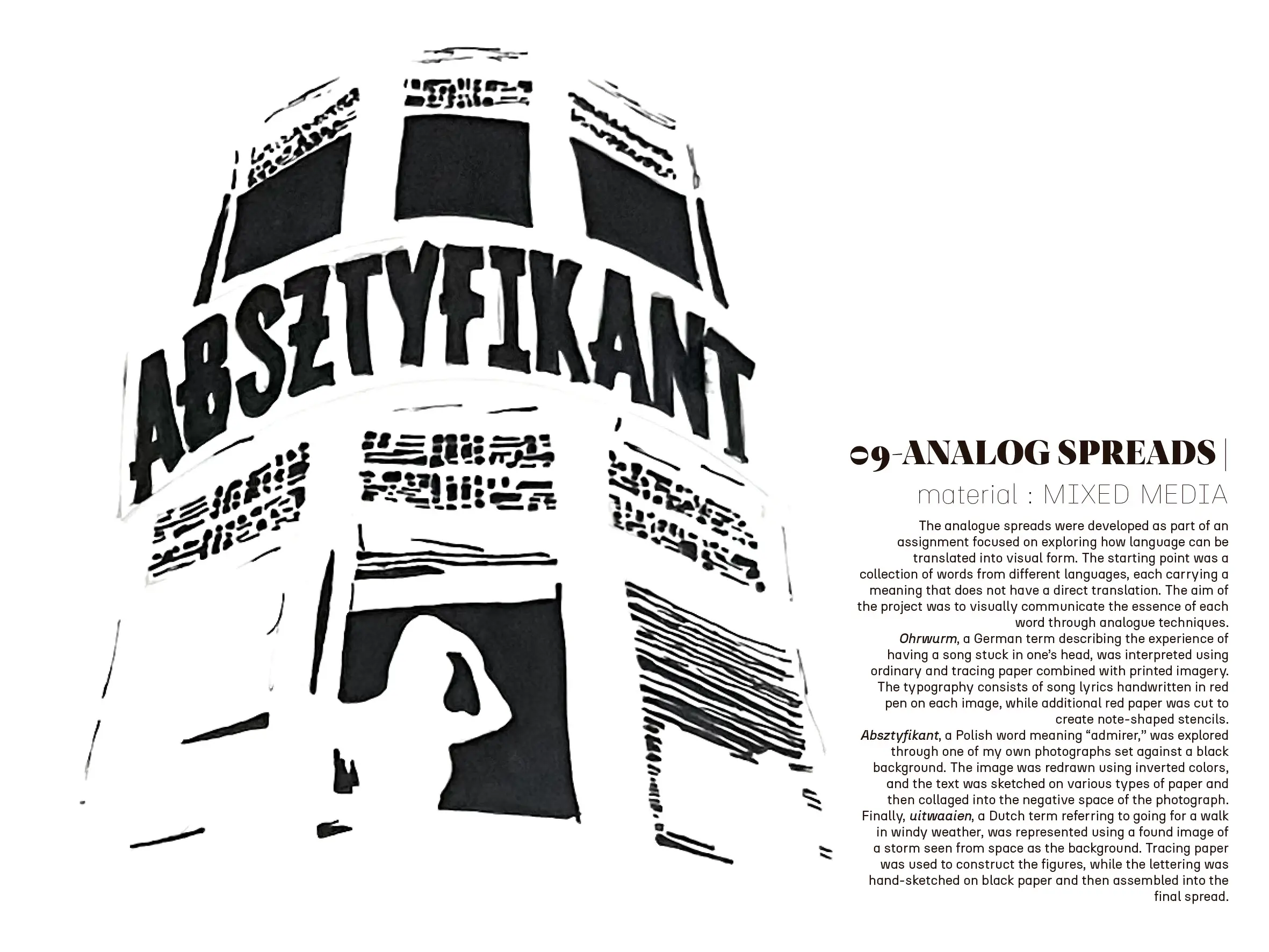
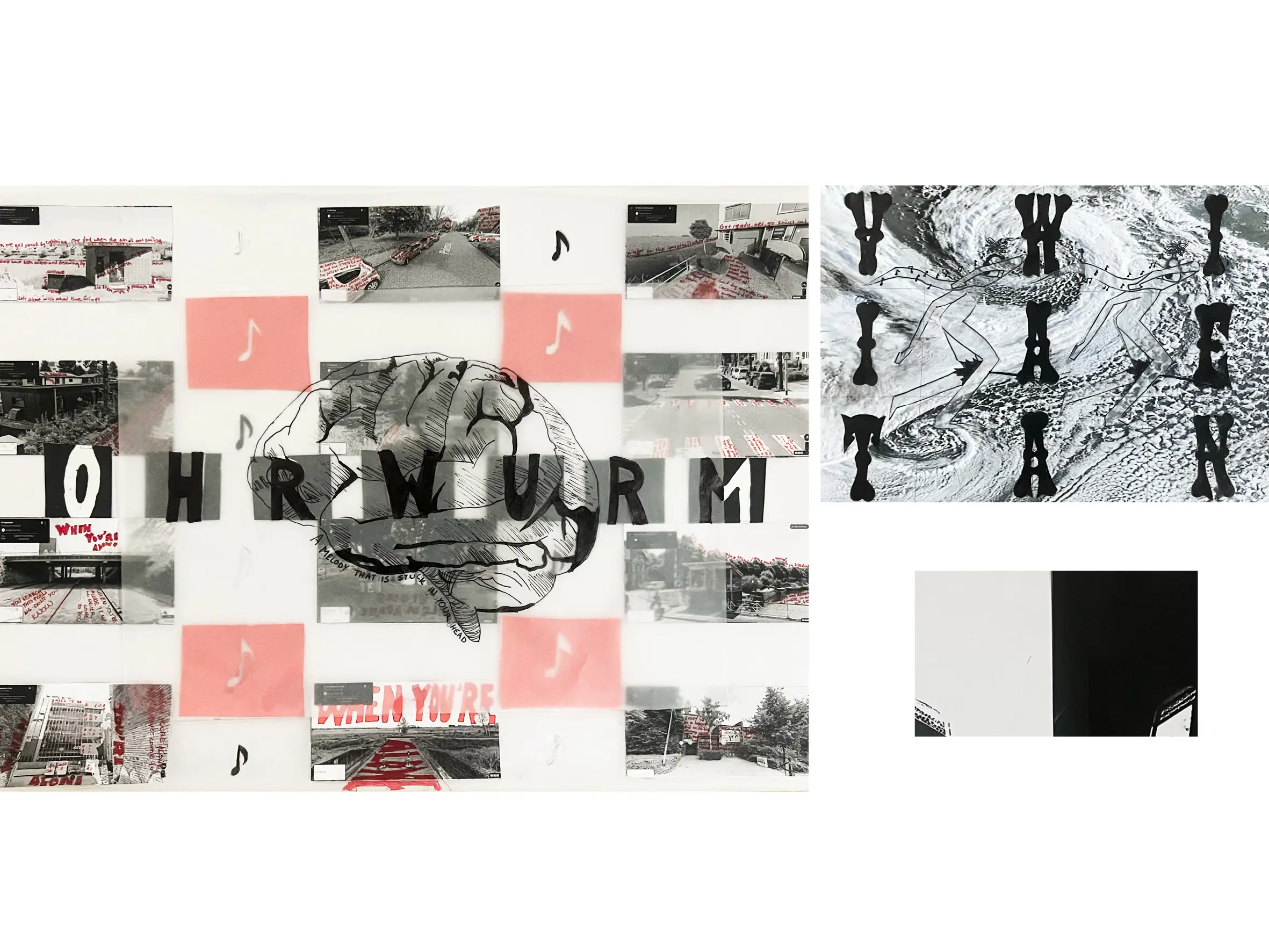
09 – ANALOG SPREADS |
material: MIXED MEDIA
The analogue spreads were developed as part of an assignment focused on exploring how language can be translated into visual form. The starting point was a collection of words from different languages, each carrying a meaning that does not have a direct translation. The aim of the project was to visually communicate the essence of each word through analogue techniques.
Ohrwurm, a German term describing the experience of having a song stuck in one’s head, was interpreted using ordinary and tracing paper combined with printed imagery. The typography consists of song lyrics handwritten in red pen on each image, while additional red paper was cut to create note-shaped stencils.
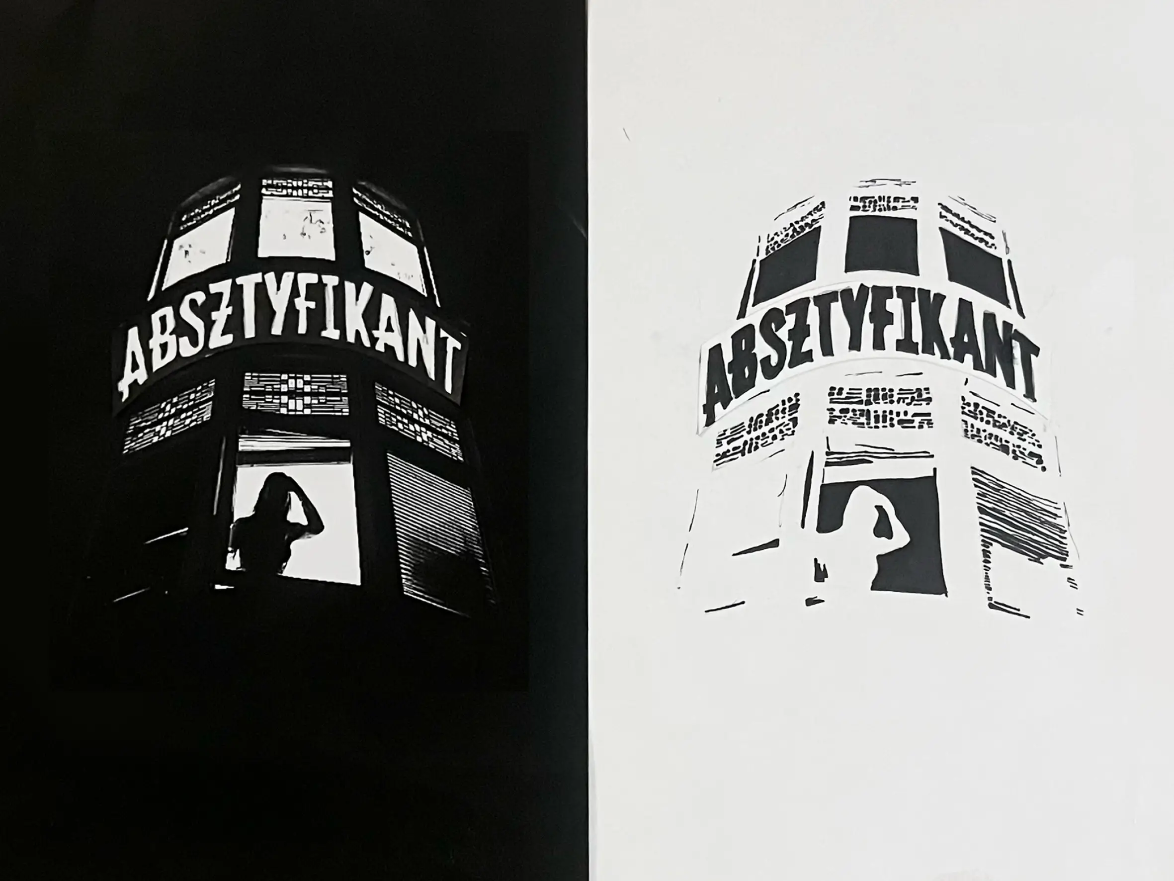
Absztyfikant, a Polish word meaning “admirer,” was explored through one of my own photographs set against a black background. The image was redrawn using inverted colors, and the text was sketched on various types of paper and then collaged into the negative space of the photograph.
Finally, uitwaaien, a Dutch term referring to going for a walk in windy weather, was represented using a found image of a storm seen from space as the background. Tracing paper was used to construct the figures, while the lettering was hand-sketched on black paper and then assembled into the final spread.
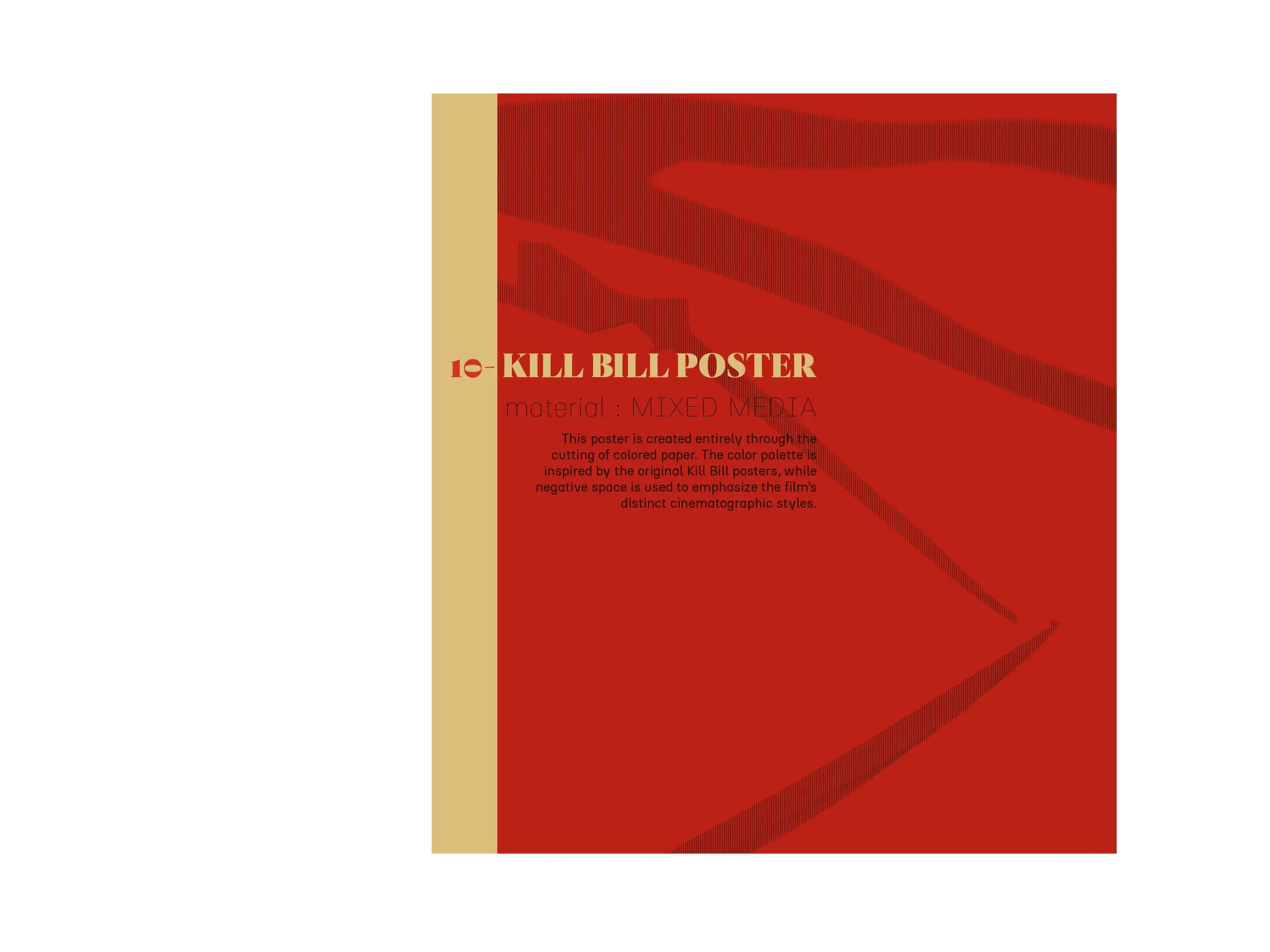
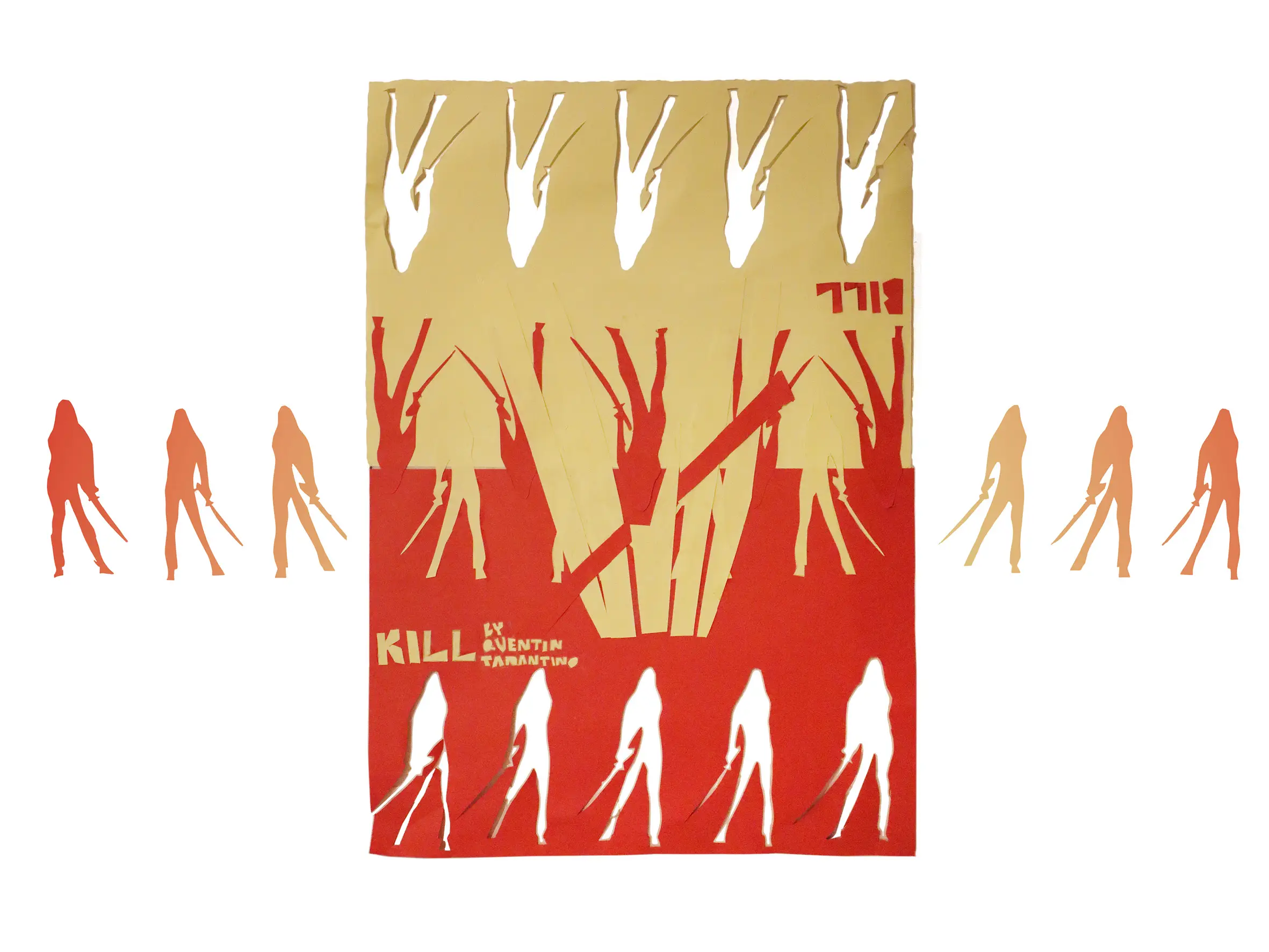
10 – KILL BILL POSTER |
material: MIXED MEDIA
This poster is created entirely through the cutting of colored paper. The color palette is inspired by the original Kill Bill posters, while negative space is used to emphasize the film’s distinct cinematographic styles.
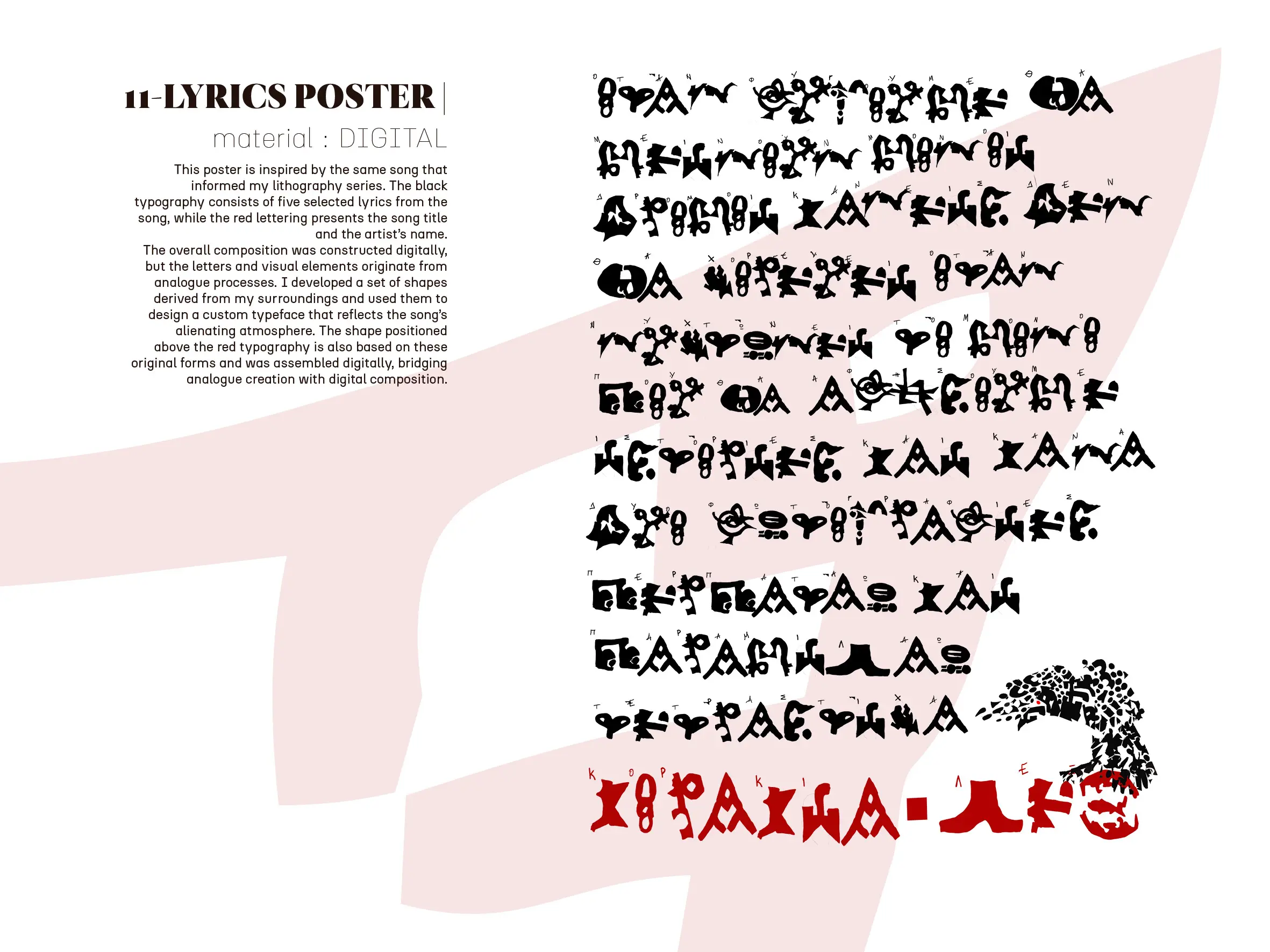
11 – LYRICS POSTER |
material: DIGITAL
This poster is inspired by the same song that informed my lithography series. The black typography consists of five selected lyrics from the song, while the red lettering presents the song title and the artist’s name.
The overall composition was constructed digitally, but the letters and visual elements originate from analogue processes. I developed a set of shapes derived from my surroundings and used them to design a custom typeface that reflects the song’s alienating atmosphere. The shape positioned above the red typography is also based on these original forms and was assembled digitally, bridging analogue creation with digital composition.
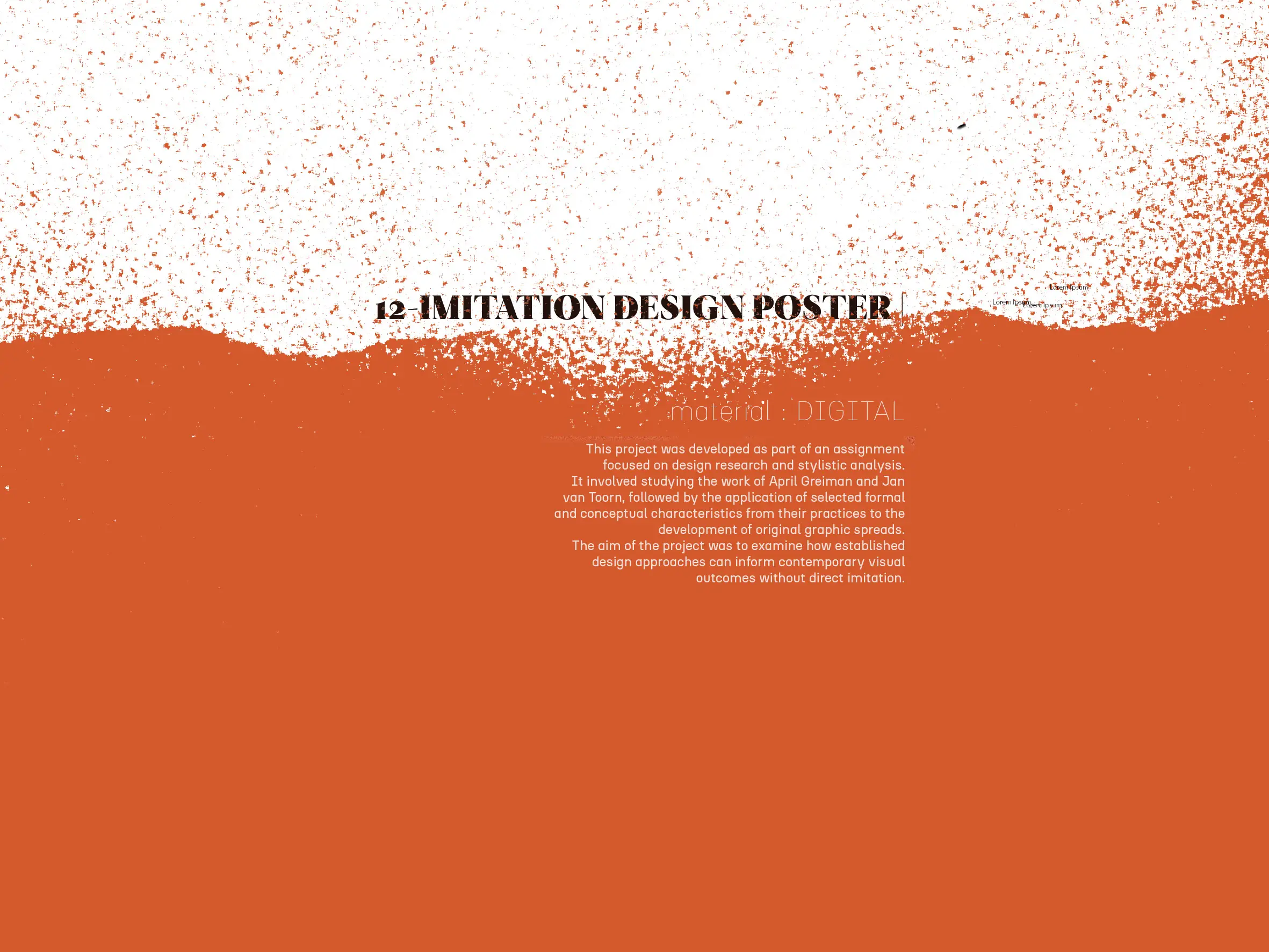
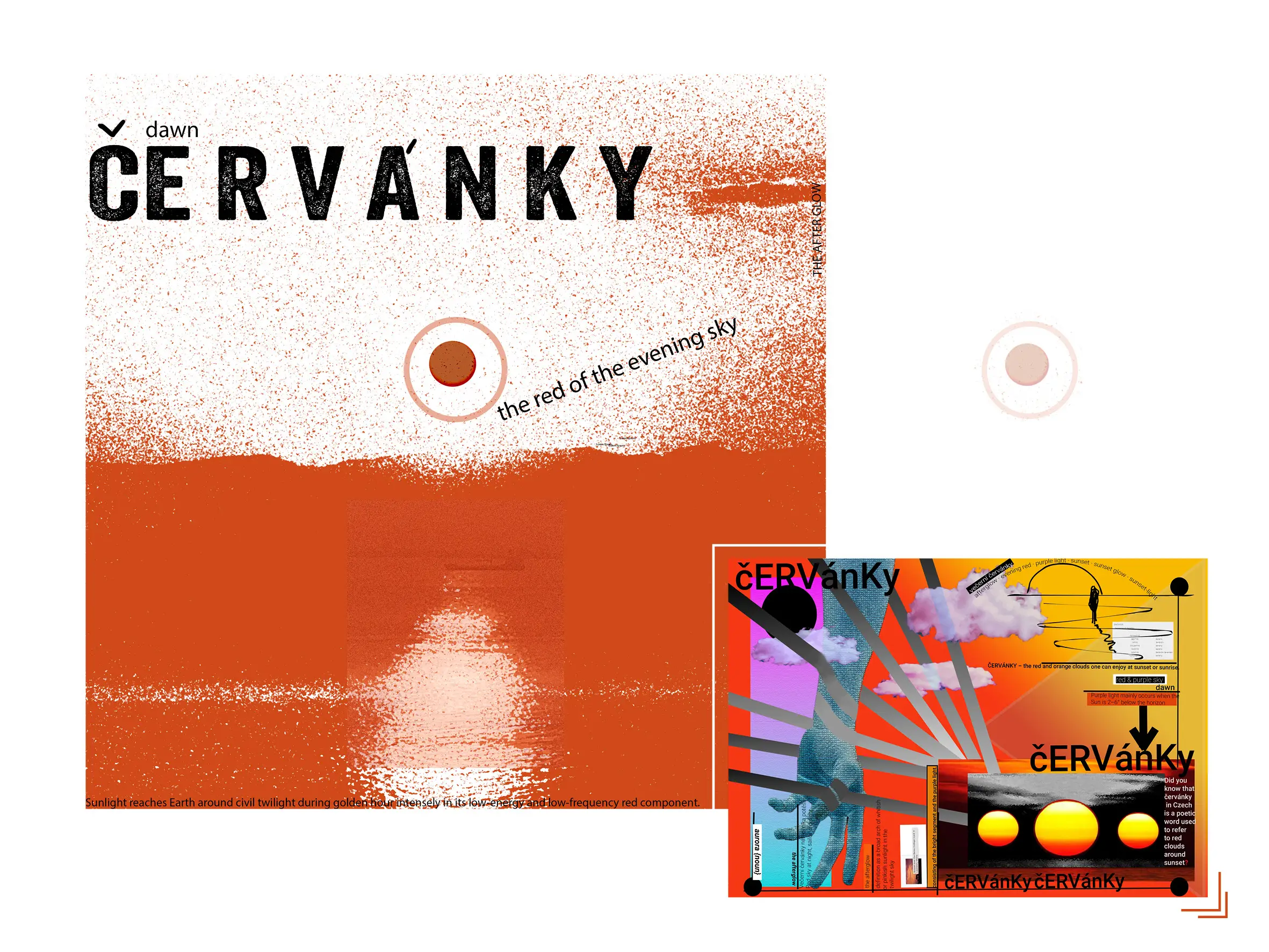
12 – IMITATION DESIGN POSTER |
material: DIGITAL
This project was developed as part of an assignment focused on design research and stylistic analysis.
It involved studying the work of April Greiman and Jan van Toorn, followed by the application of selected formal and conceptual characteristics from their practices to the development of original graphic spreads.
The aim of the project was to examine how established design approaches can inform contemporary visual outcomes without direct imitation.
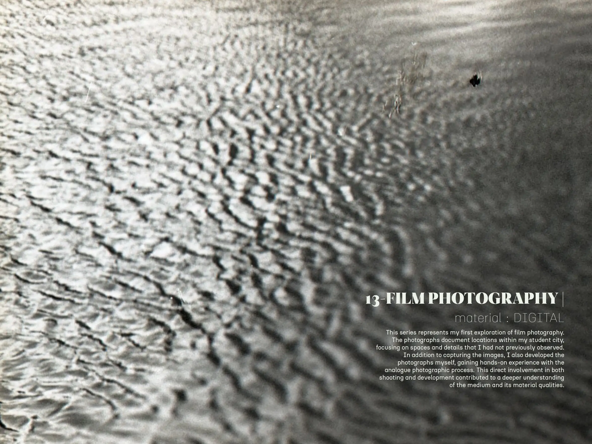
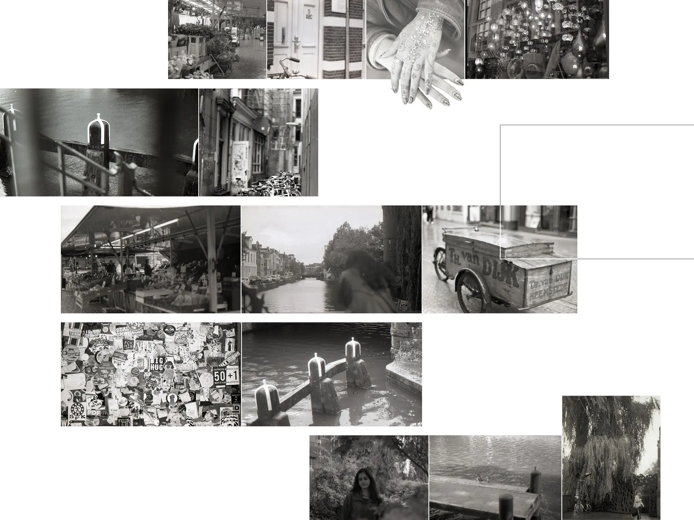
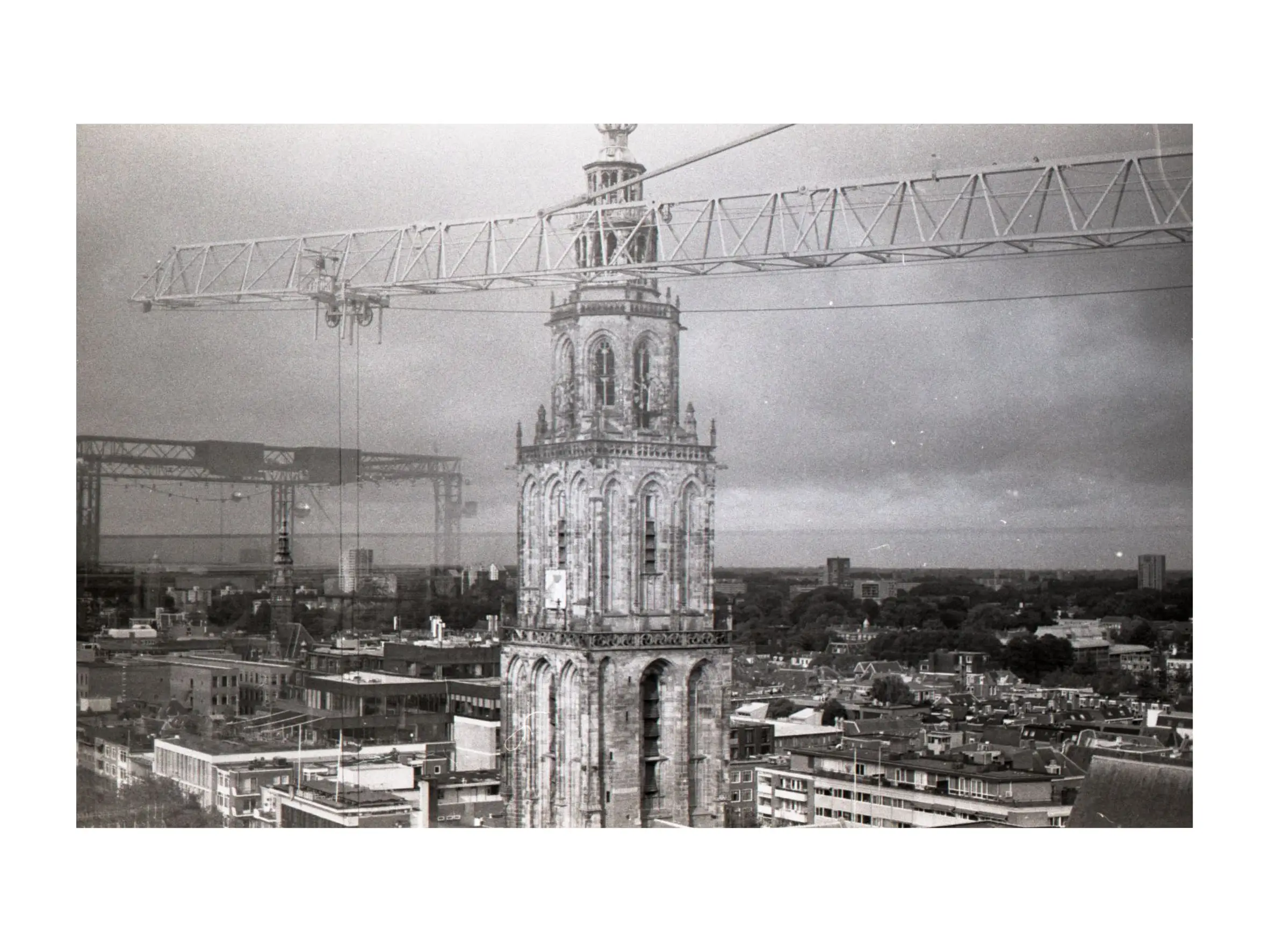
13 – FILM PHOTOGRAPHY |
material: DIGITAL
This poster is inspired by the same song that informed my lithography series. The black typography consists of five selected lyrics from the song, while the red lettering presents the song title and the artist’s name.
The overall composition was constructed digitally, but the letters and visual elements originate from analogue processes. I developed a set of shapes derived from my surroundings and used them to design a custom typeface that reflects the song’s alienating atmosphere. The shape positioned above the red typography is also based on these original forms and was assembled digitally, bridging analogue creation with digital composition.
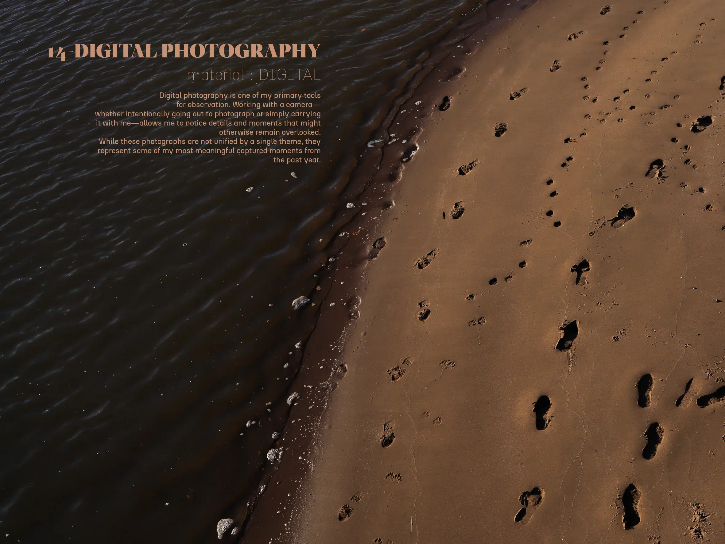
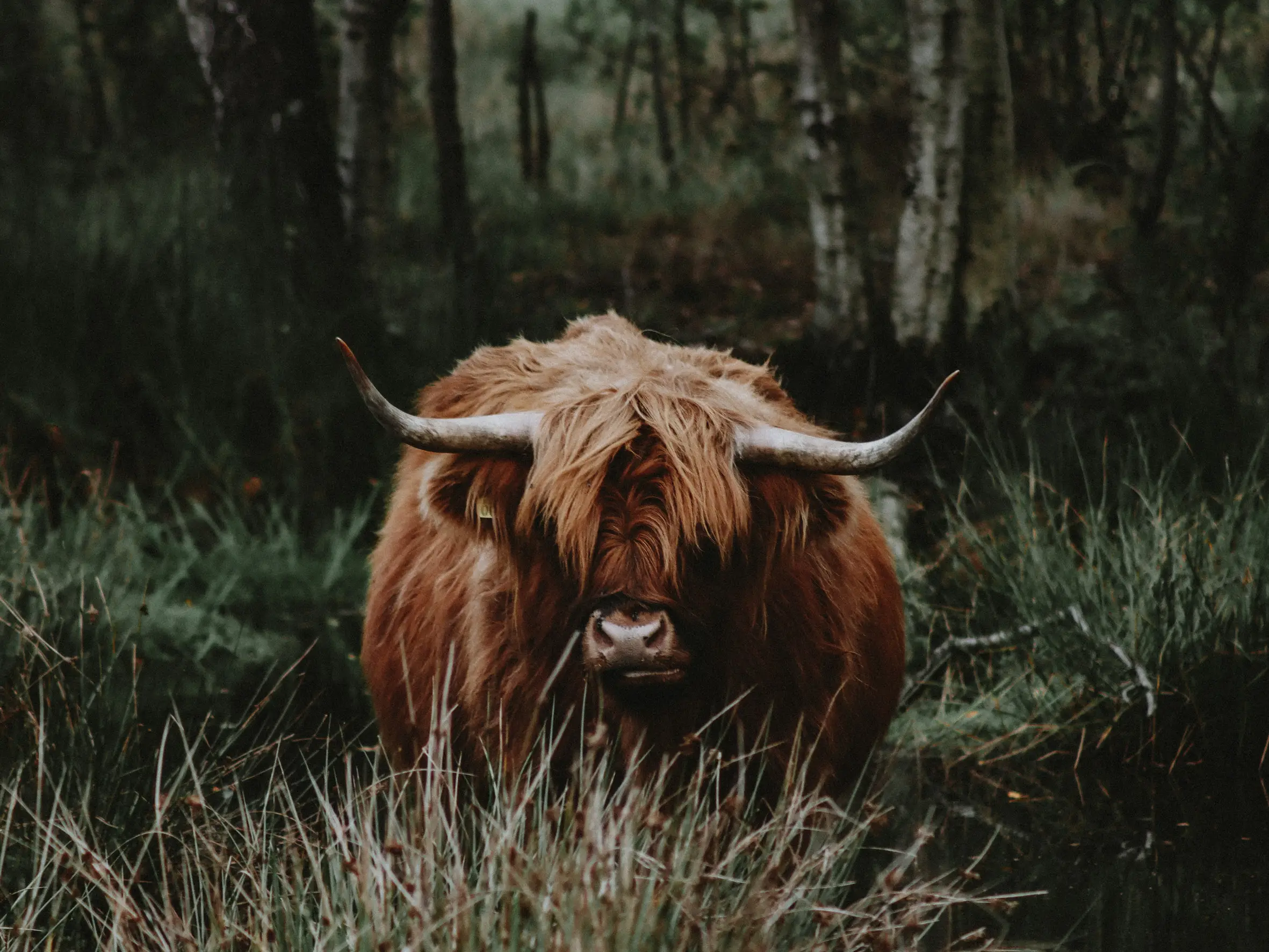
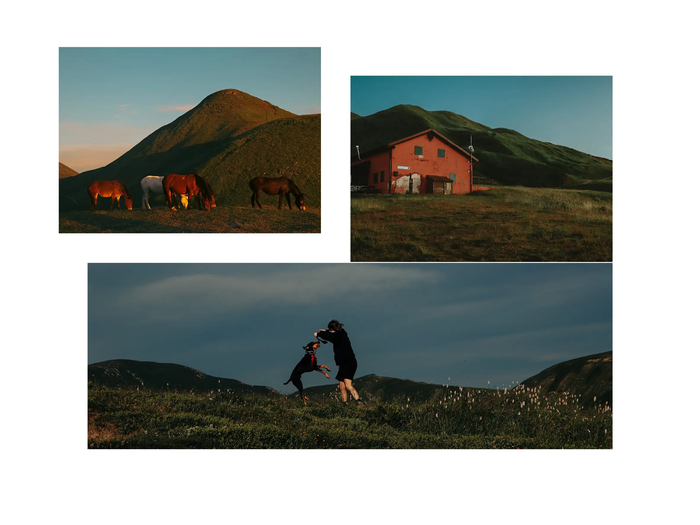
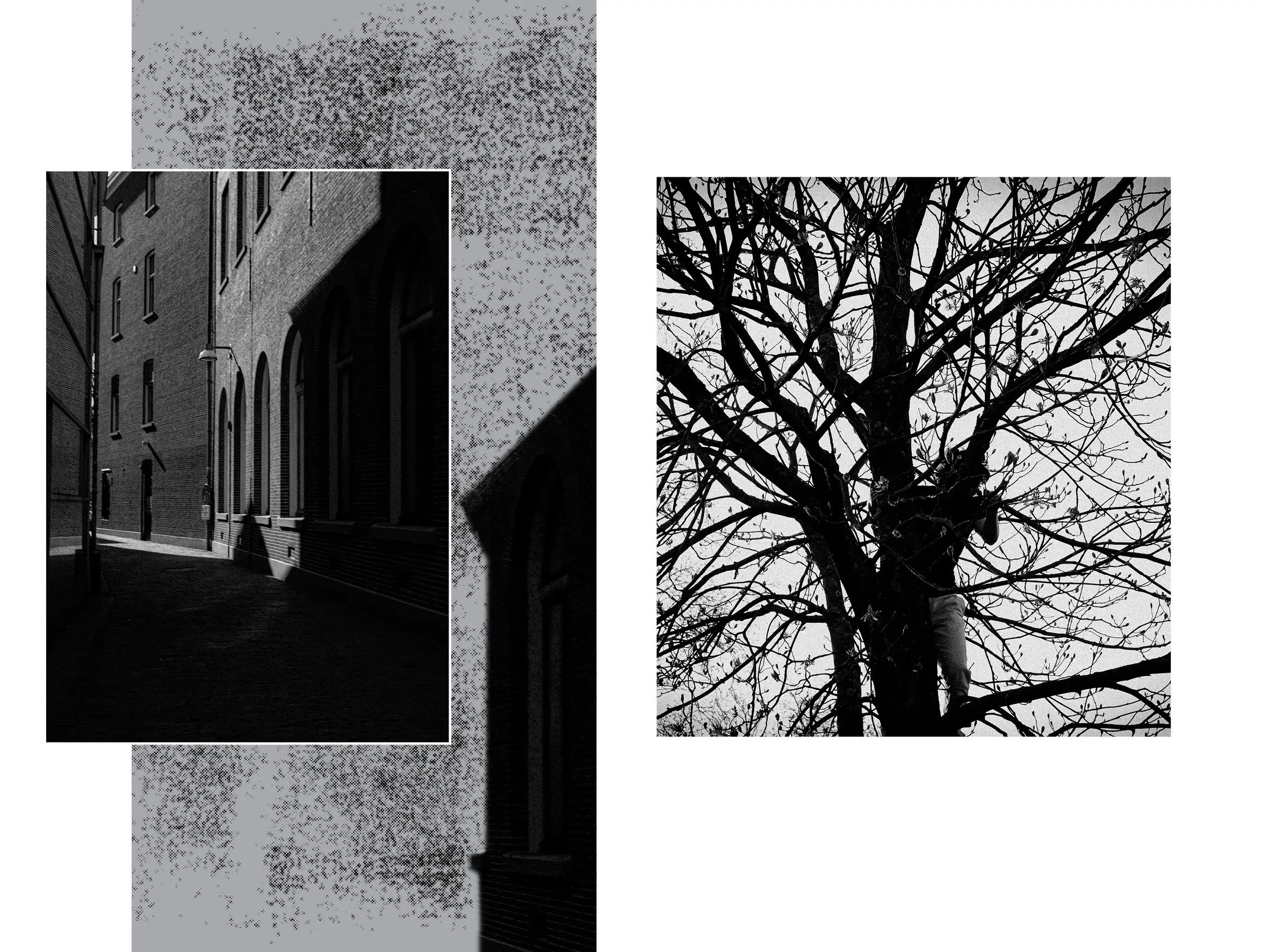
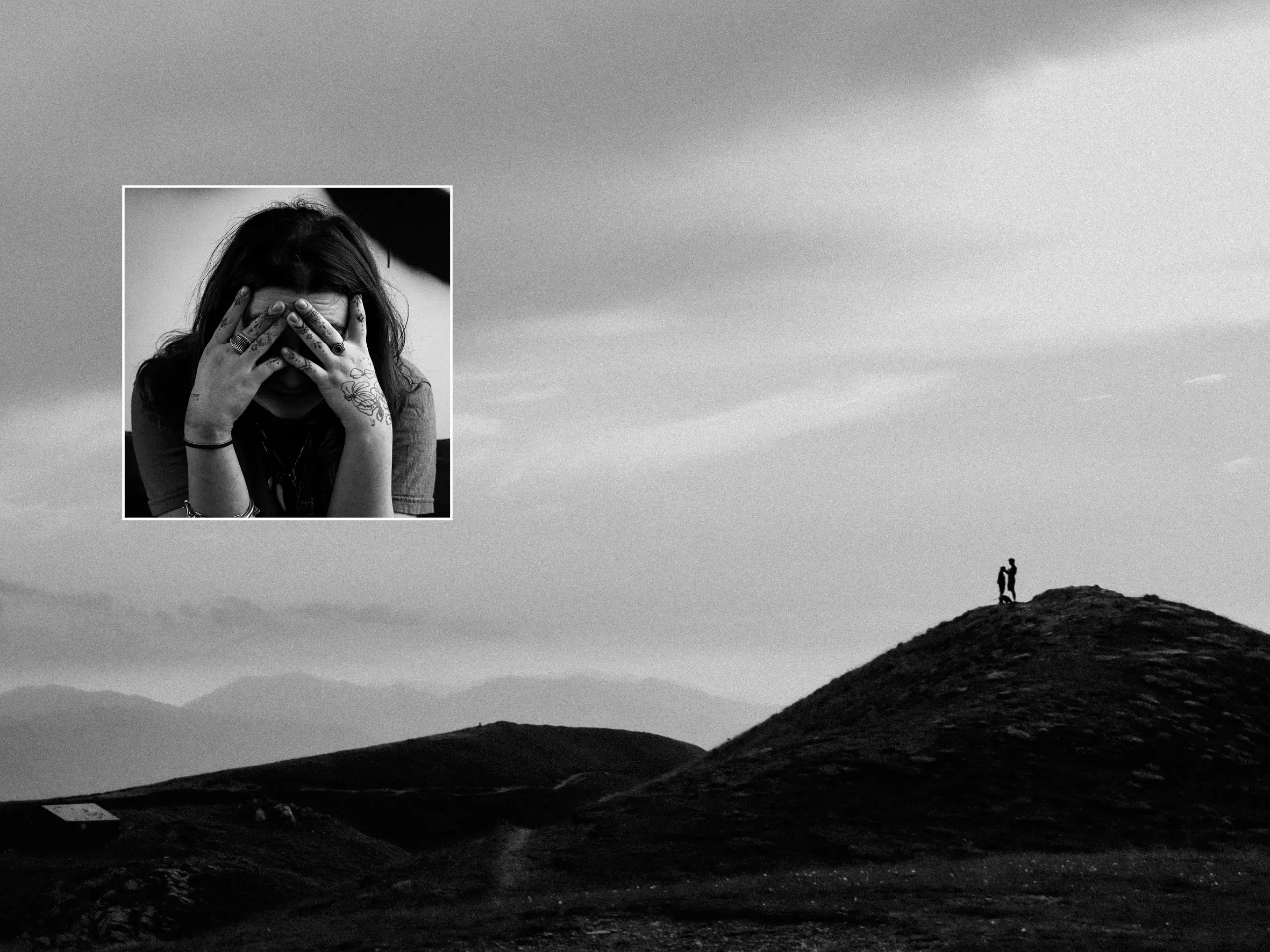
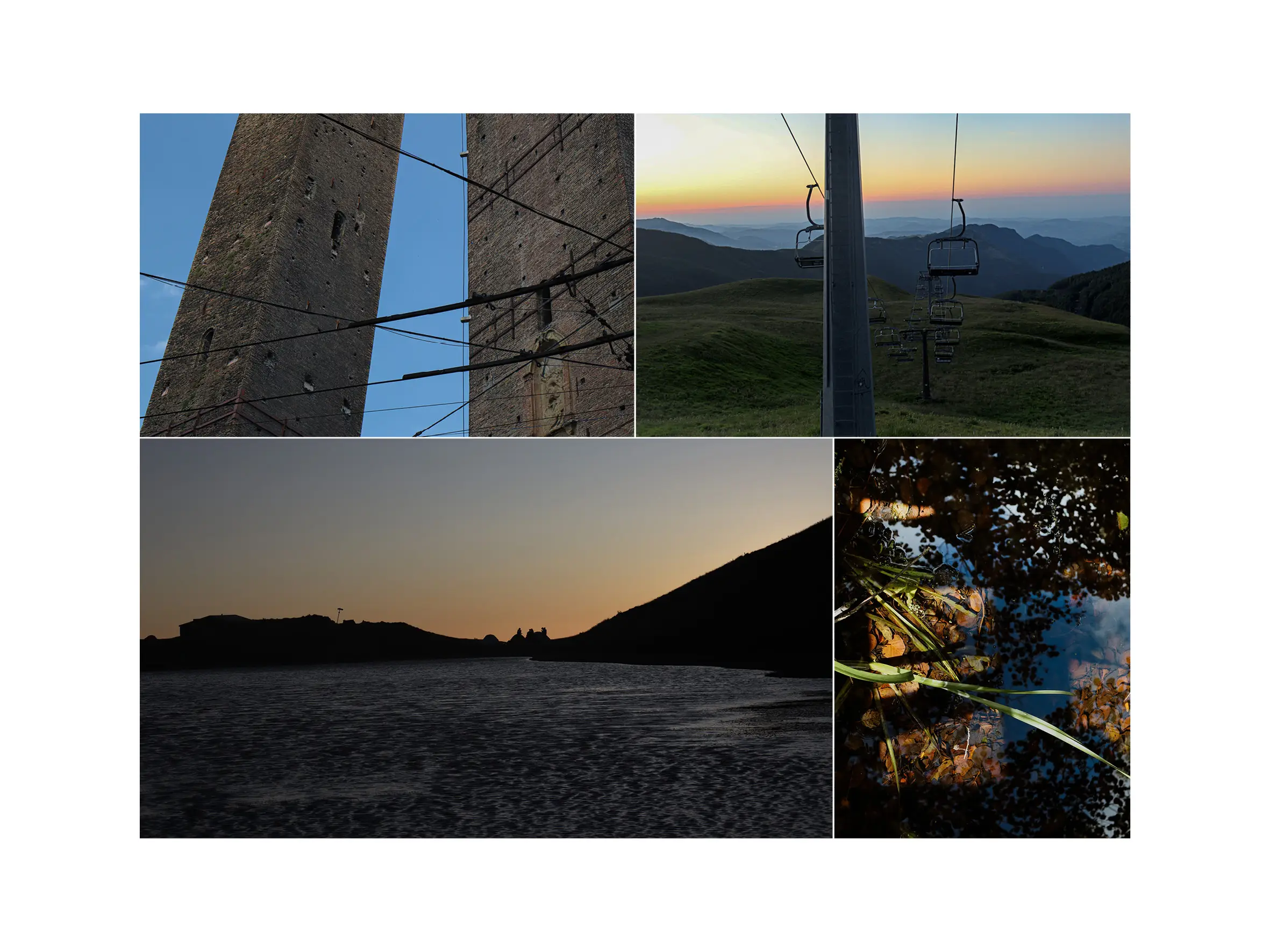
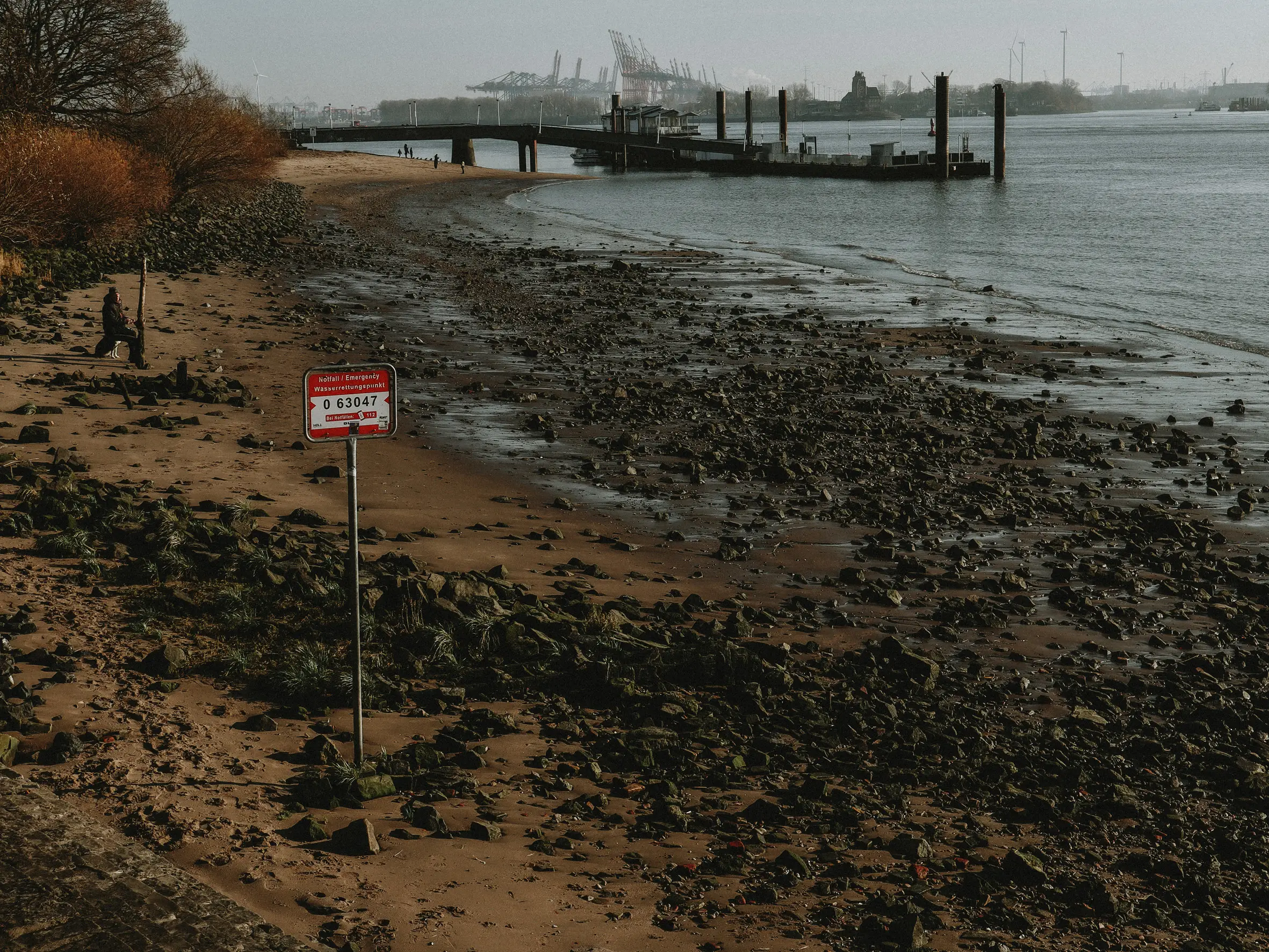
14 – DIGITAL PHOTOGRAPHY |
material: DIGITAL
Digital photography is one of my primary tools for observation. Working with a camera—whether intentionally going out to photograph or simply carrying it with me—allows me to notice details and moments that might otherwise remain overlooked.
While these photographs are not unified by a single theme, they represent some of my most meaningful captured moments from the past year.
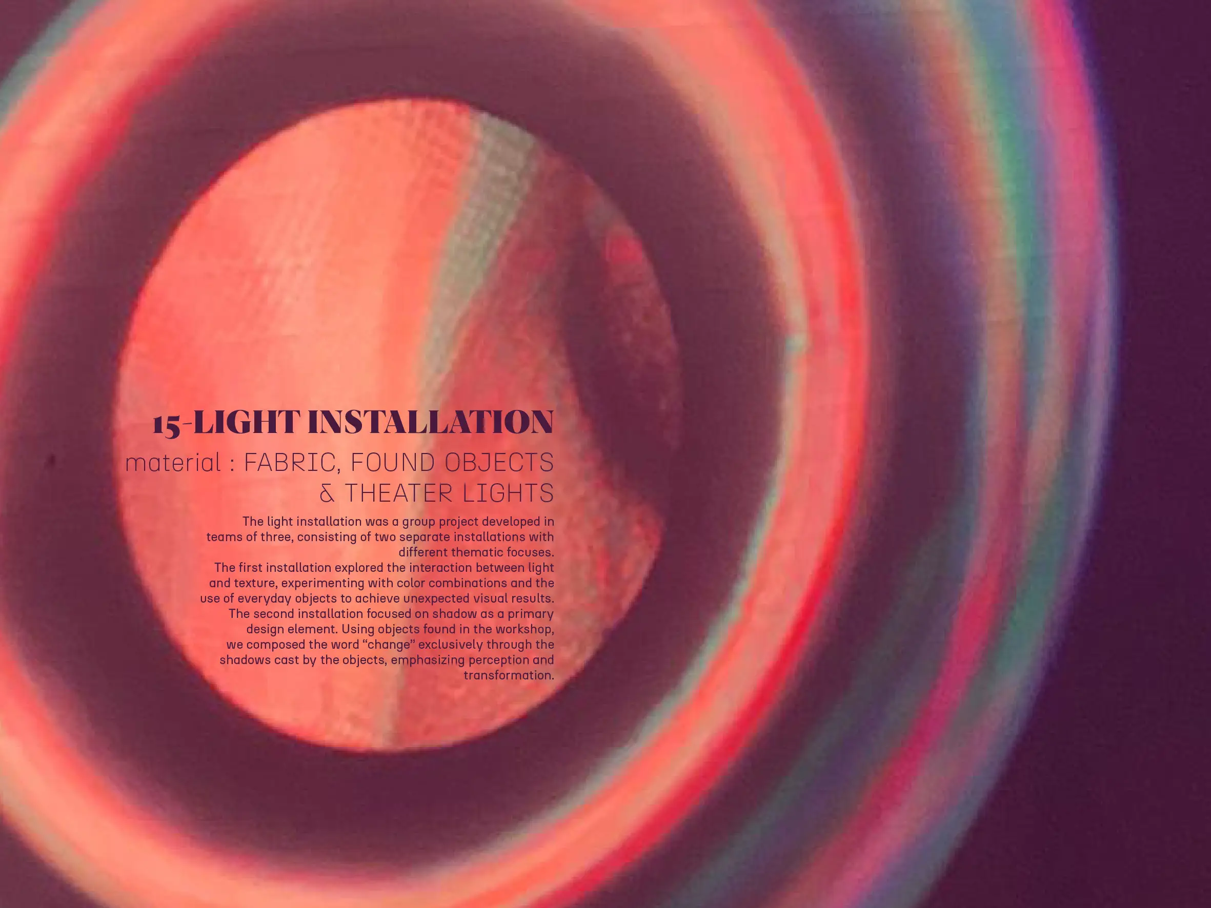
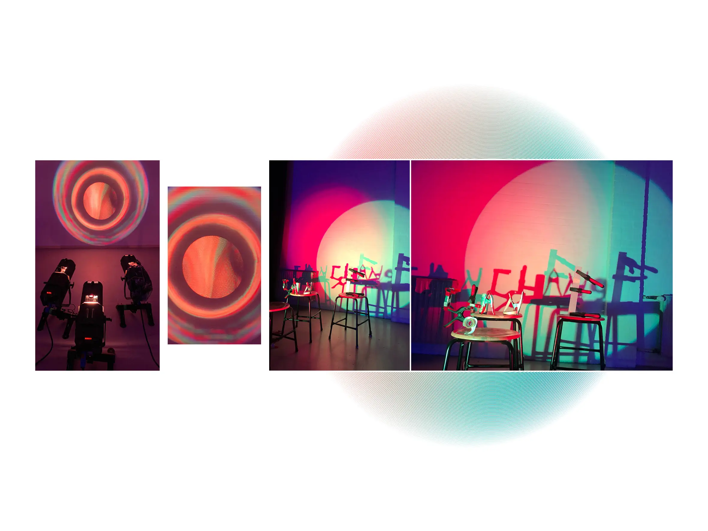
15 – LIGHT INSTALLATION |
material: FABRIC, FOUND OBJECTS
& THEATER LIGHTS
The light installation was a group project developed in teams of three, consisting of two separate installations with different thematic focuses.
The first installation explored the interaction between light and texture, experimenting with color combinations and the use of everyday objects to achieve unexpected visual results. The second installation focused on shadow as a primary design element. Using objects found in the workshop, we composed the word “change” exclusively through the shadows cast by the objects, emphasizing perception and transformation.
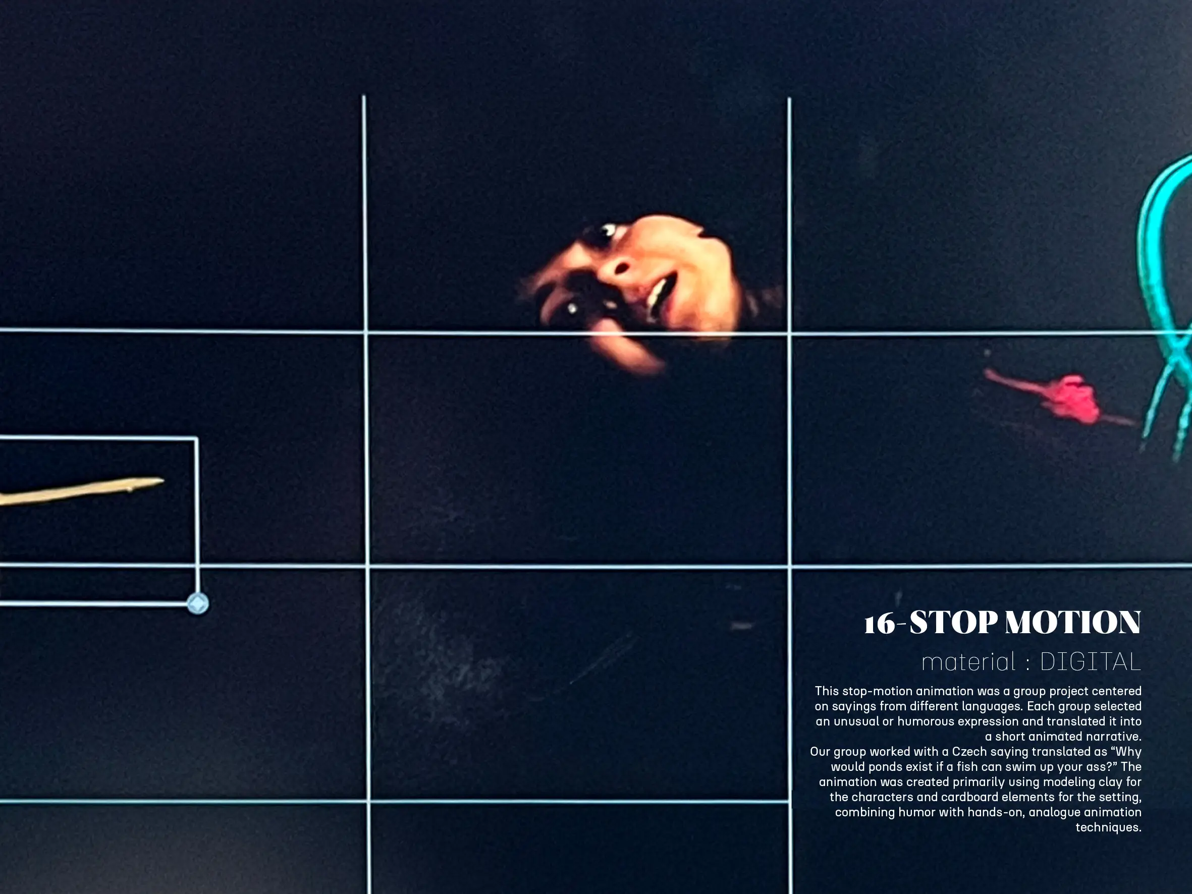
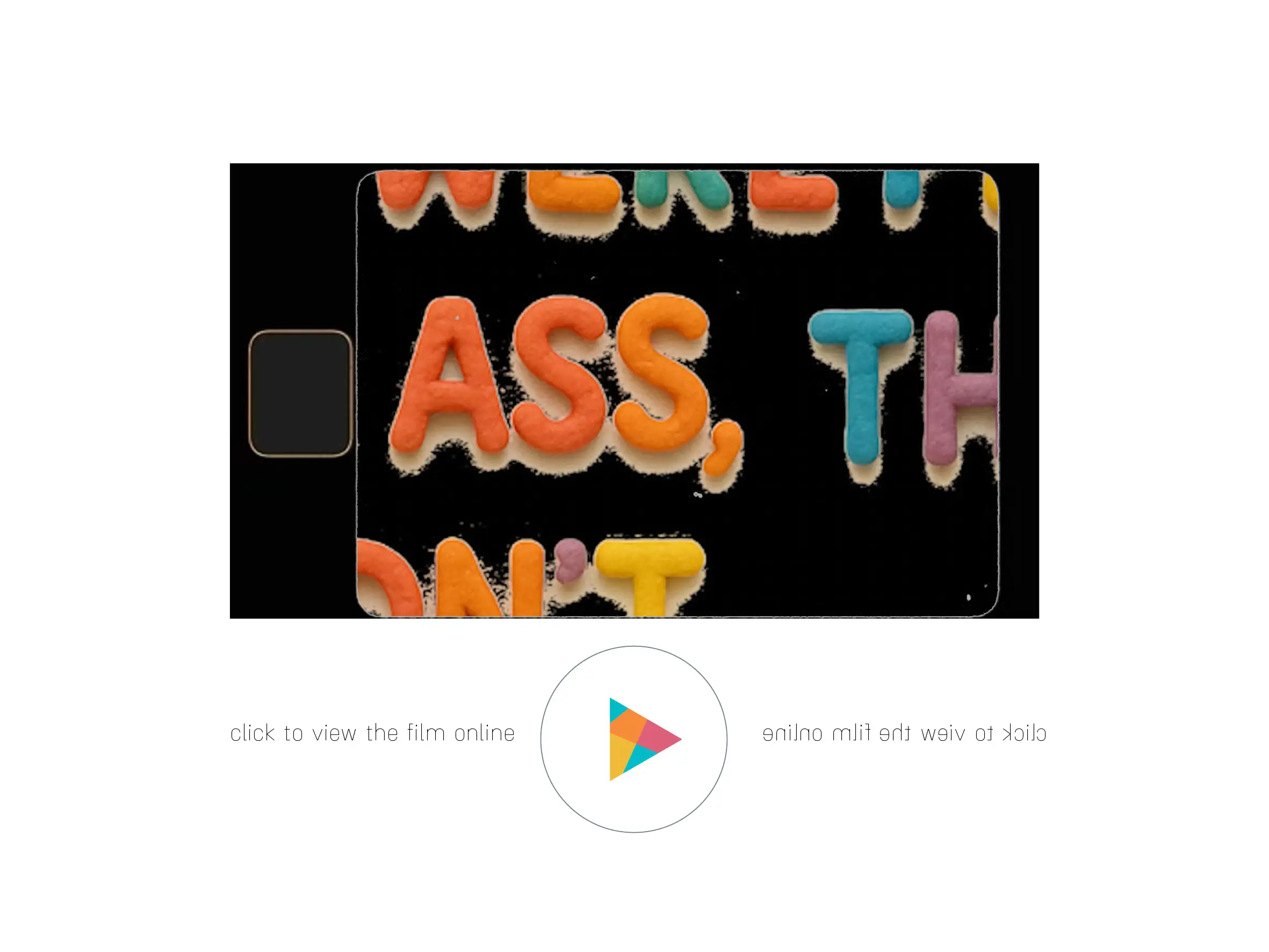
16 – STOP MOTION |
material: DIGITAL
This stop-motion animation was a group project centered on sayings from different languages. Each group selected an unusual or humorous expression and translated it into a short animated narrative.
Our group worked with a Czech saying translated as “Why would ponds exist if a fish can swim up your ass?” The animation was created primarily using modeling clay for the characters and cardboard elements for the setting, combining humor with hands-on, analogue animation techniques.
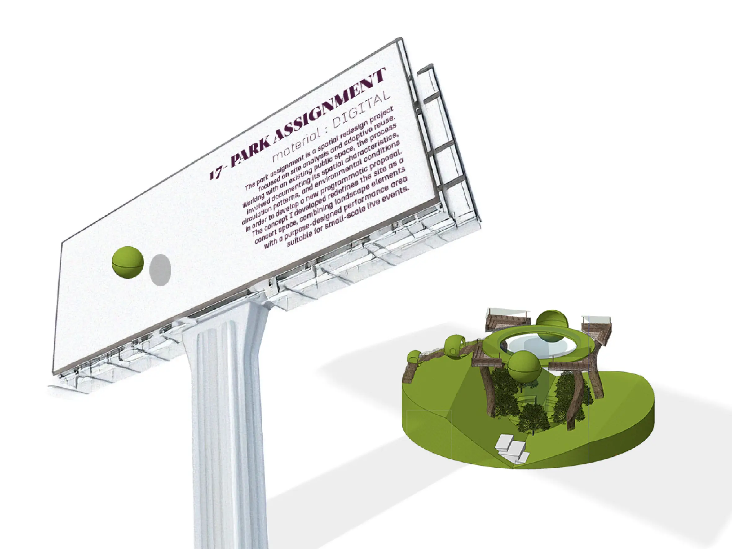
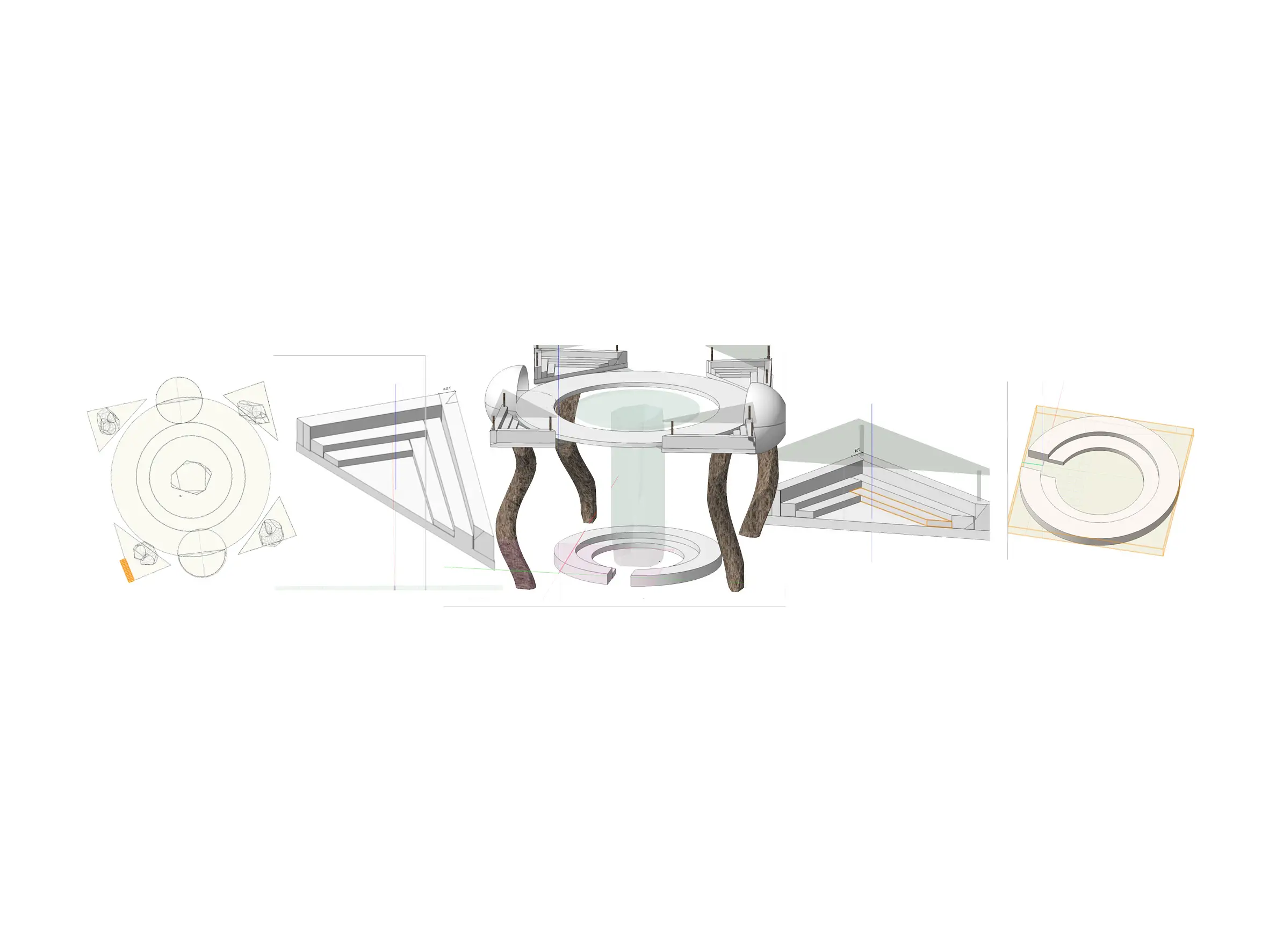
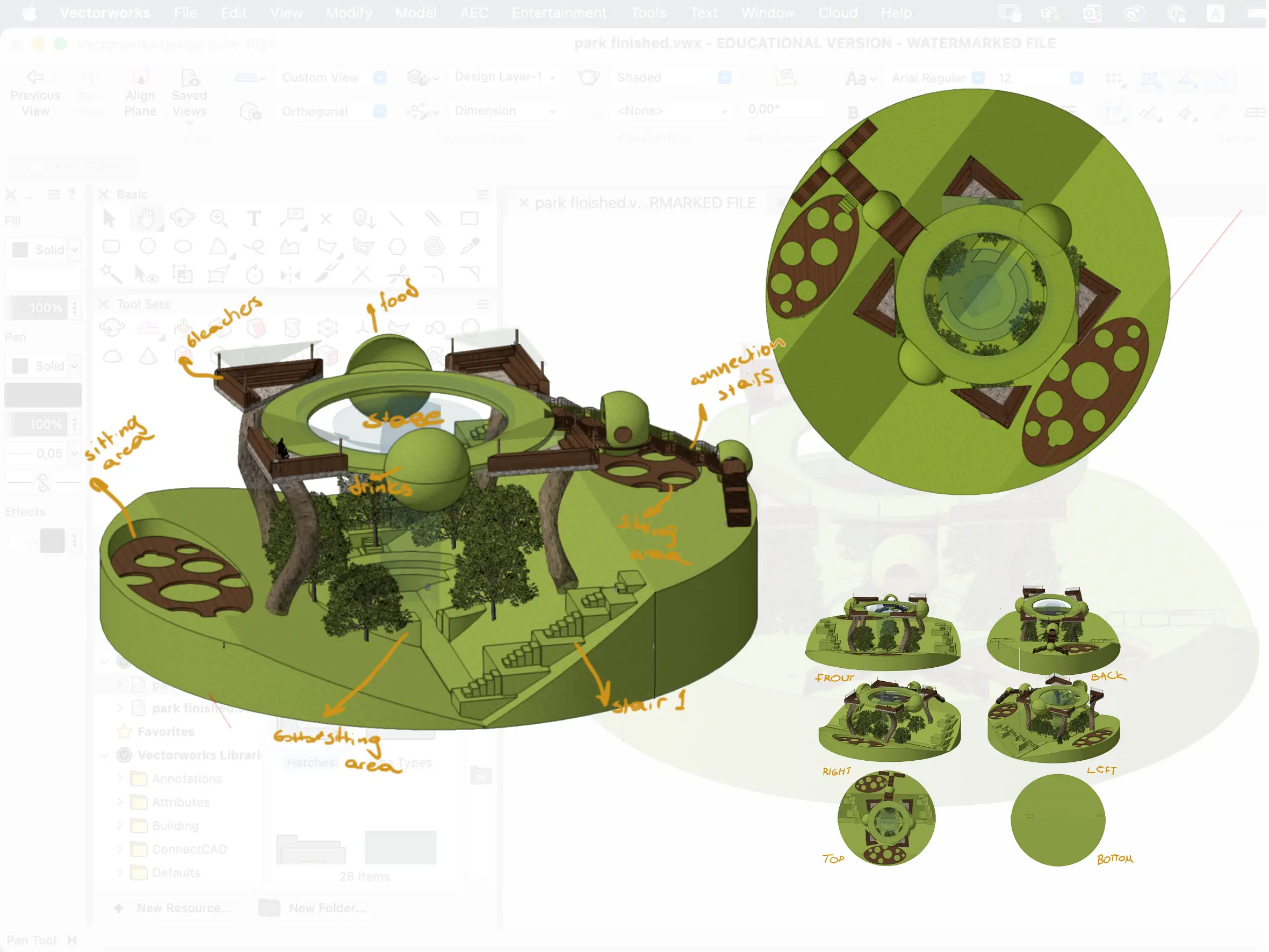
17 – PARK ASSIGNMENT |
material: DIGITAL
The park assignment is a spatial redesign project focused on site analysis and adaptive reuse. Working with an existing public space, the process involved documenting its spatial characteristics, circulation patterns, and environmental conditions in order to develop a new programmatic proposal. The concept I developed redefines the site as a concert space, combining landscape elements with a purpose-designed performance area suitable for small-scale live events.
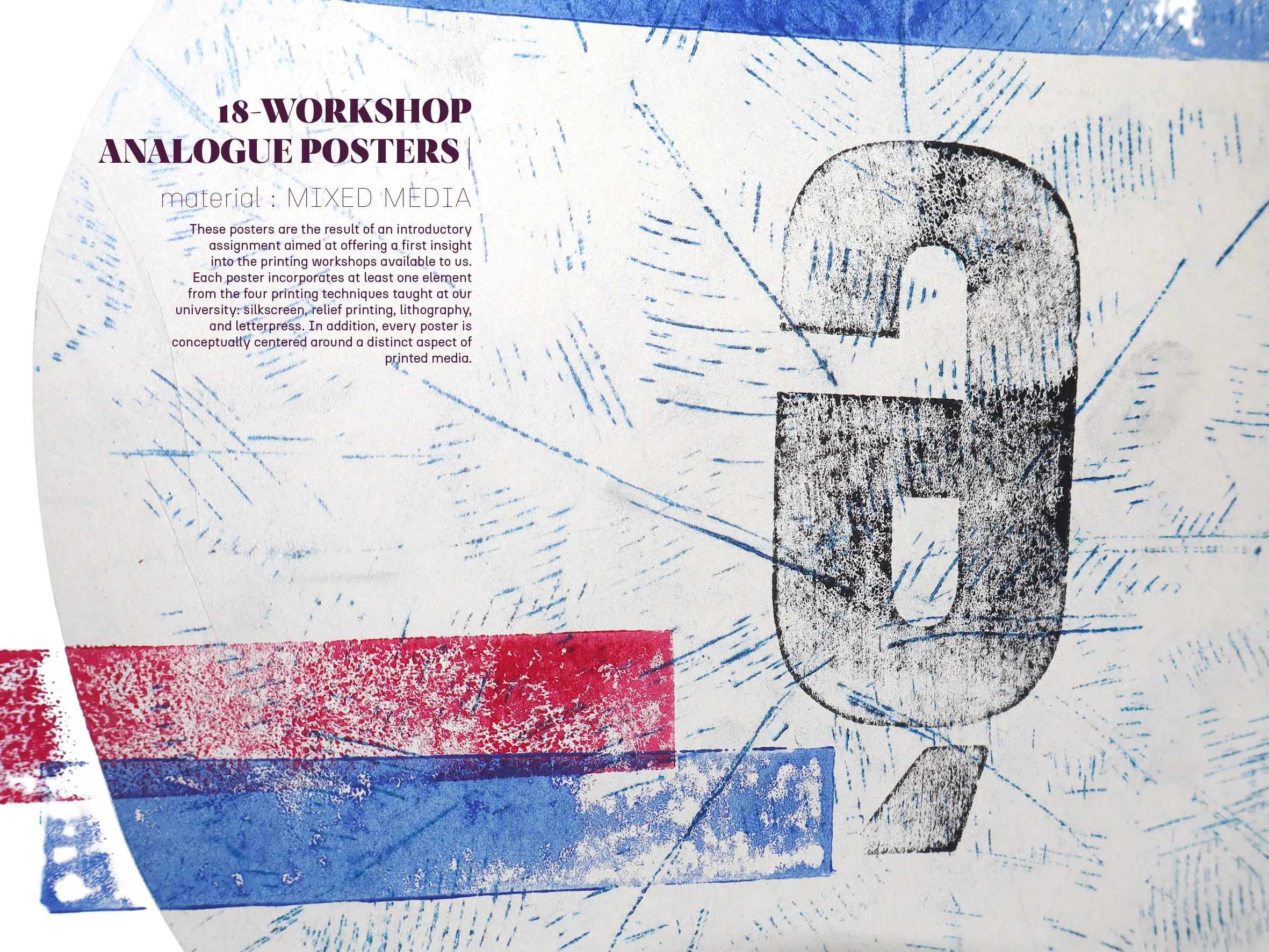
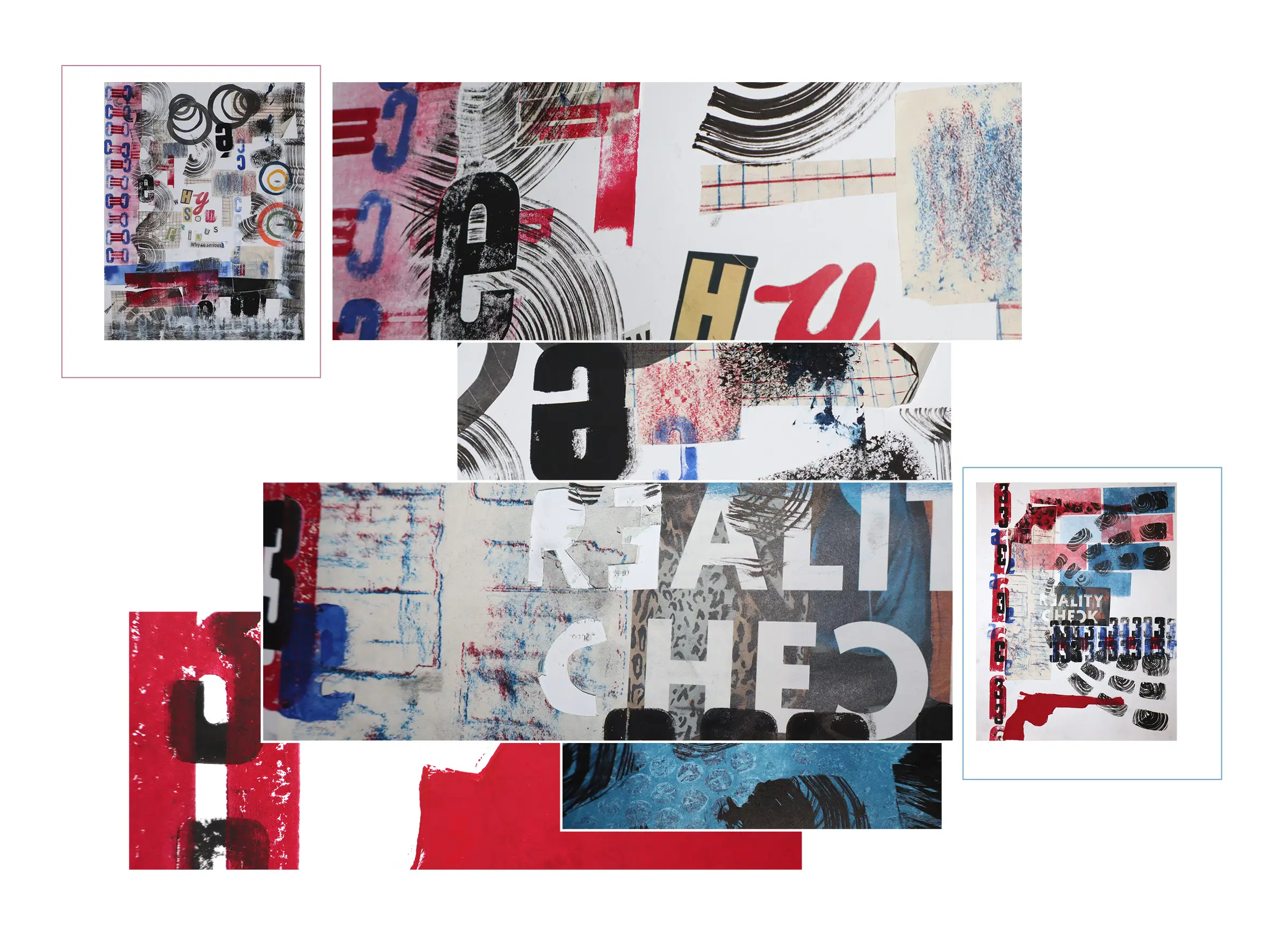
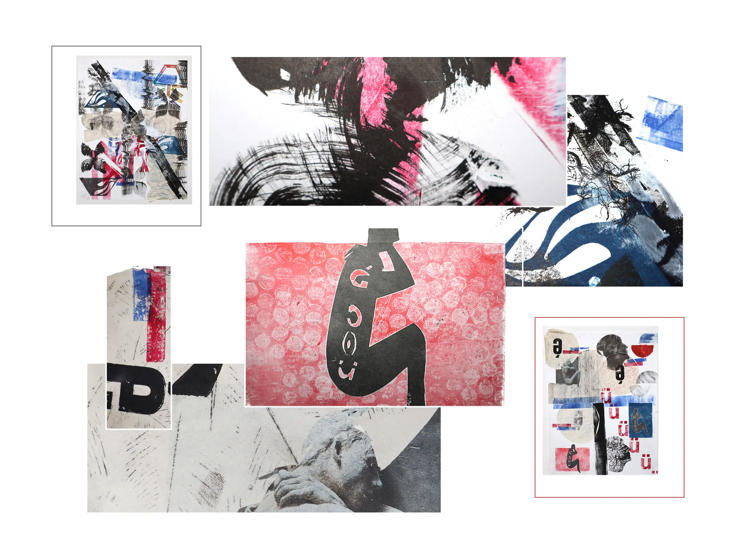
18 – WORKSHOP ANALOGUE POSTERS |
material: MIXED MEDIA
DiThese posters are the result of an introductory assignment aimed at offering a first insight into the printing workshops available to us. Each poster incorporates at least one element from the four printing techniques taught at our university: silkscreen, relief printing, lithography, and letterpress. In addition, every poster is conceptually centered around a distinct aspect of printed media.
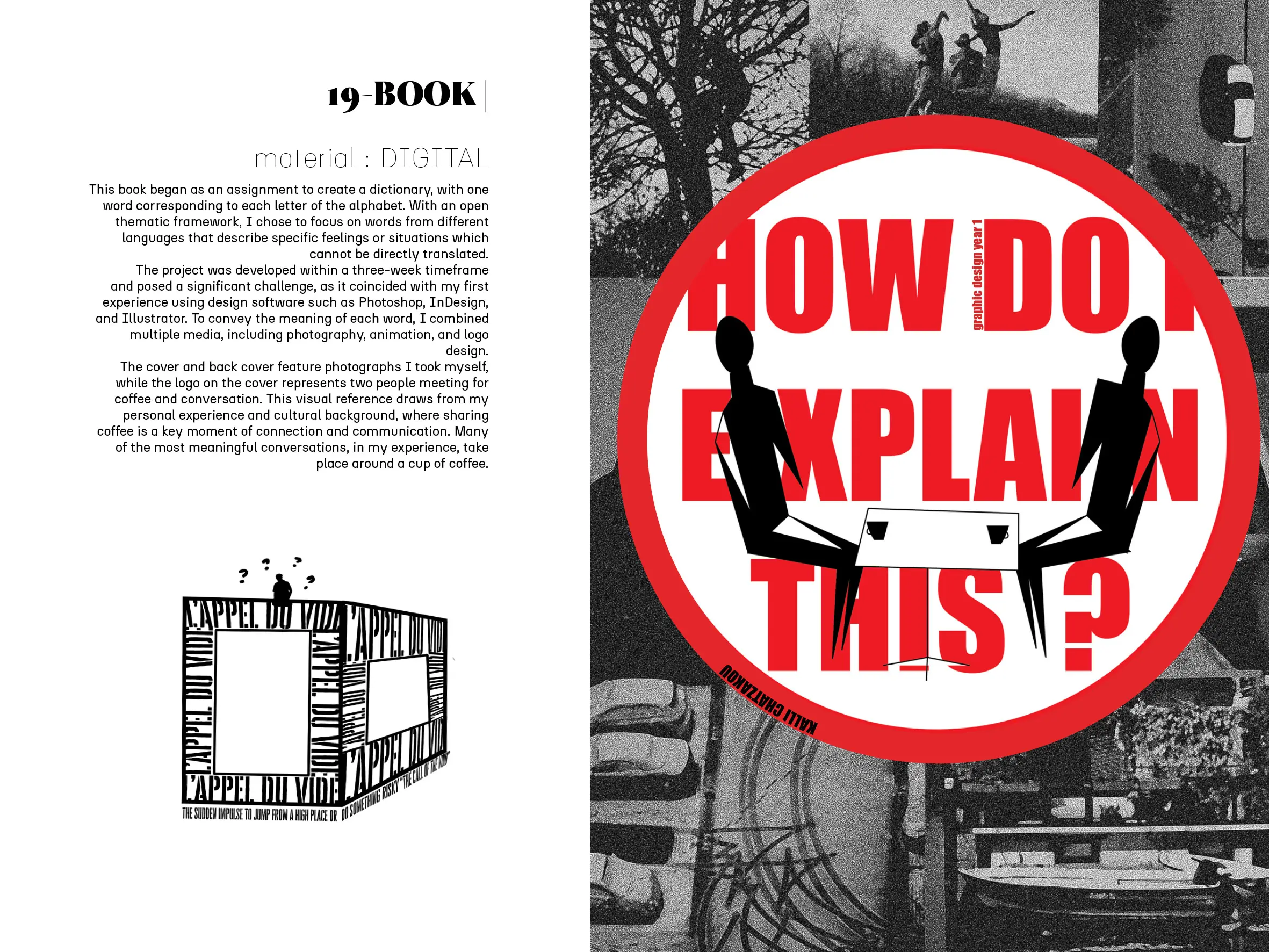
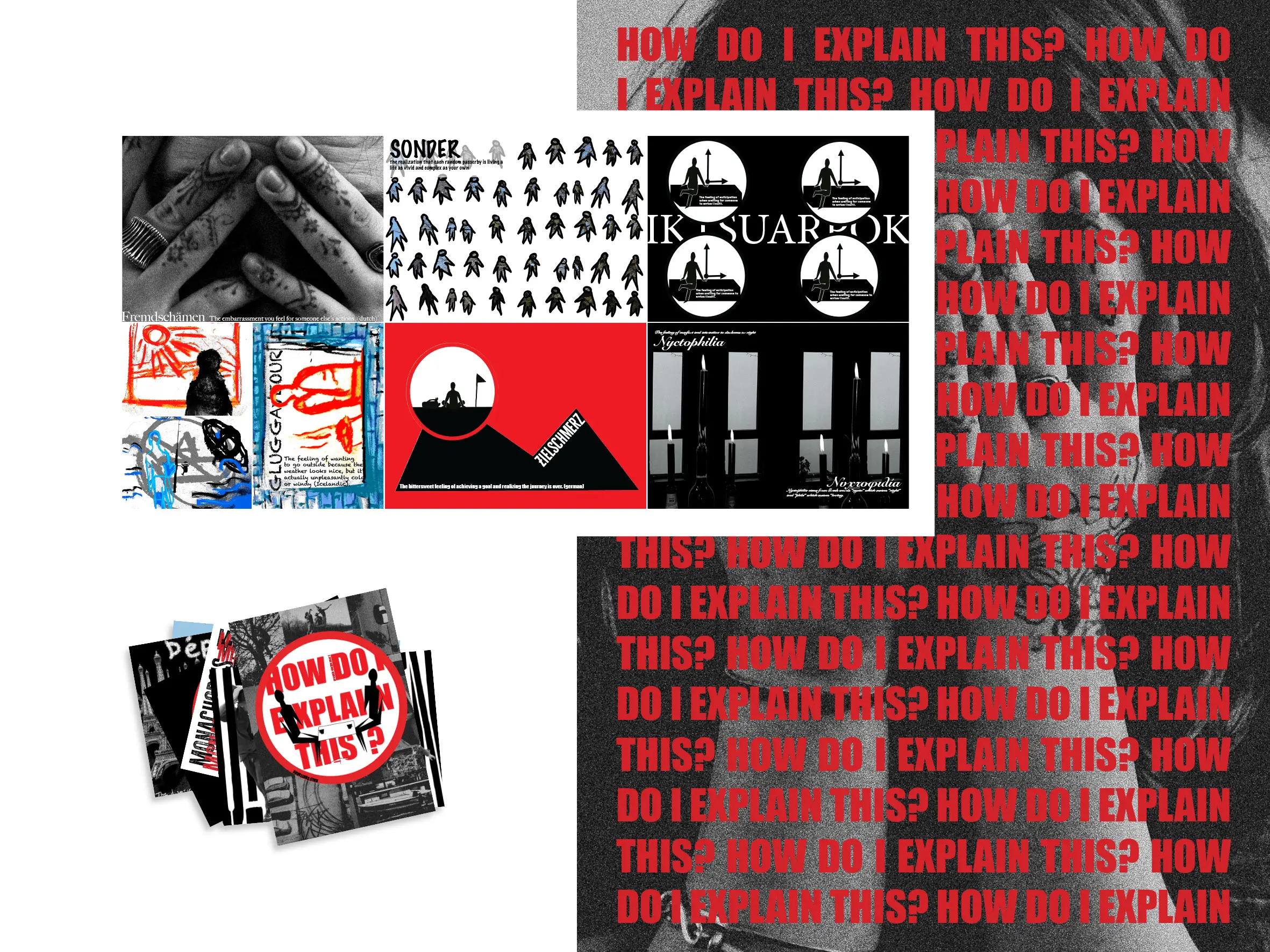
19 – BOOK |
material: DIGITAL
This book began as an assignment to create a dictionary, with one word corresponding to each letter of the alphabet. With an open thematic framework, I chose to focus on words from different languages that describe specific feelings or situations which cannot be directly translated.
The project was developed within a three-week timeframe and posed a significant challenge, as it coincided with my first experience using design software such as Photoshop, InDesign, and Illustrator. To convey the meaning of each word, I combined multiple media, including photography, animation, and logo design.
The cover and back cover feature photographs I took myself, while the logo on the cover represents two people meeting for coffee and conversation. This visual reference draws from my personal experience and cultural background, where sharing coffee is a key moment of connection and communication. Many of the most meaningful conversations, in my experience, take place around a cup of coffee.